This is the content.php article

Have relationships between professional graphic designers and their clients changed in 2017? Adobe surveyed 600 creatives and marketers in the US to see how well they think they work together. The response is positive; most think they work pretty well together, but ultimately, as in all things, there is always room for improvement! Check out all of Adobe’s findings in detail.

This is the content.php article

Some products you like and others you rave about to your friends, despite there not being much difference in functionality between either. Why is that? The design gurus at UXDESIGN.CC tackled this with their post on emotional design, and showed how it’s the “secret weapon” of several popular brands. But how to implement emotional design?

Use contrast and delight.
We all know Slack, right? You probably have it pulled up right now. It’s the fastest growing workplace software ever but doesn’t differ much in functionality from its competitor HipChat. A possible reason why? Slack looks noticeably different and therefore stands out. Notice the round shapes, the vibrant colors and the friendly typeface and emojis. That’s good emotional design.

Use personality and humor.
Mailchimp has a sense of humor, and they show it in their product. Notice the copy used on the front page and the graphics users receive as they send out email blasts. The message? Mailchimp is your friend.

Use rewards.
Anytime we’re anticipating a reward, we get a release of dopamine, which keeps us repeating certain behaviors … like checking our social media feeds for new likes and comments. Instagram in particular utilizes rewards very effectively.

Find out how Apple, Google and others use emotional design, how that makes you feel as you interact with those products and how emotional design can benefit your brand!

This is the content.php article


Do you see it?!

No matter how big the job or budget is, graphic designers are only human, and sometimes people make mistakes. This designer must be very embarrassed to have used two right hands on Netflix’s poster for The Babysitter! Or maybe this graphic designer is a genius and has fueled a publicity stunt? The world may never know but we love the conversation that the fail has sparked.


This is the content.php article

North Korean tour guide Nicholas Bonner has collected graphic design samples from over twenty years on the job, recently compiled into a book published by Phaidon. These fascinating images offer a rarely seen glimpse into the secretive country, where despite tense relations with the world, life goes on as normal for the residents. See what the products they see every day look like!

This is the content.php article

You know Brand and Identity are important for your, well…brand, but what exactly does that even mean? GCFLearnFree.org breaks down the basics for you in a cute and informative video. It always pays to expand your graphic design knowledge, and when you decide you want to implement anything you’ve learned, KEYLAY Design is your resource!


This is the content.php article

With the barrage of daily political and social commentary hitting us from all angles, it’s important to remember that there is still positivity in the world. For the past 6 months, KEYLAY Design has worked with the non-profit group, Rainbros, to show the city of Atlanta as a beacon of hope and love. What began as a request to help contribute a mural design for a building, grew into something greater than any one person or business.

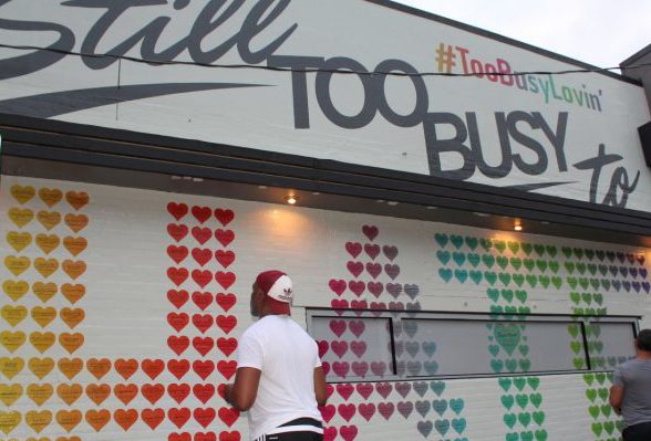
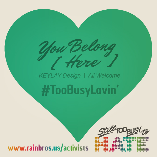
Known as “The City too Busy to Hate” back in the 60’s, we wanted to visually include a 2017 version of this message into the mural. The solution was to include voices from members of the community in the form of positive messages within the ultimate symbol of love–the heart. Many will notice that the word “Hate” is composed of nothing but words of pure love. This is to counter the intolerance and negativity surrounding the word “Hate”.  The purpose of this wall is not to divide, but to protect. To celebrate the diversity, tolerance, and inclusiveness of this great city.

Ultimately, this 6-month process included several rounds of designs, revisions, and tweaks. KEYLAY’s graphic design team took on the challenges of large-format printing to create an amazing result. We created multiple comp images of how the final design would look on 10th and Piedmont. During the review process, we considered feedback from the owner of 10th and Piedmont, the Rainbros, and others who wanted to ensure that this design represented the best of Atlanta. KEYLAY also worked closely with Prima Printing Atlanta to ensure that the design would print properly and fit the specifications of the building. In addition, many design considerations were made for how the design would wrap against the street-facing window, which also opens into the restaurant.

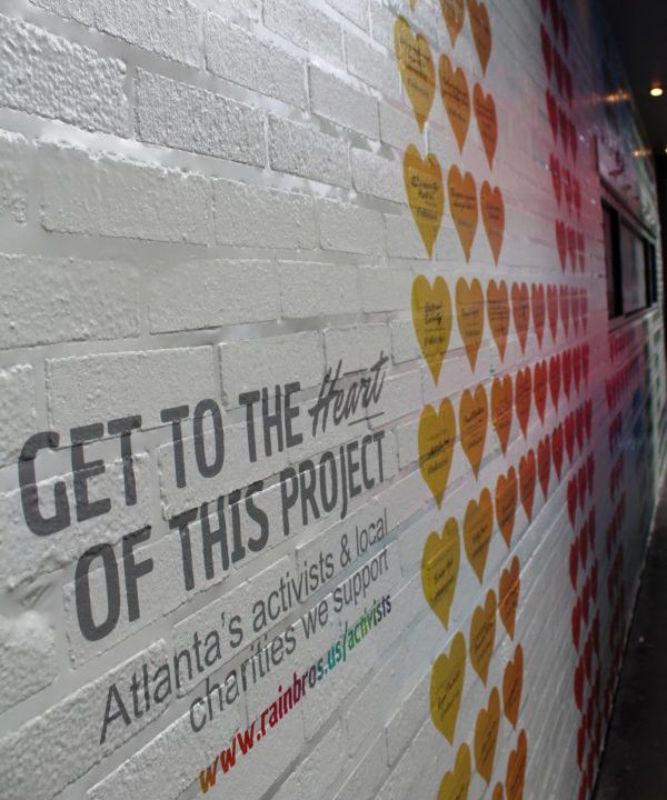
We’re proud of how the community came together to show that in the darkness, there is always a brilliant light in the distance. KEYLAY is happy to have contributed our time and graphic design skills to help a city we love so much. In addition to the design installation at 10th and Piedmont, the donations given to this project will also aid the following local charities:

TransHousing Atlanta Program

Lost-N-Found Youth

Georgia Latino Alliance for Human Rights

The Link Counseling Center

The Atlanta Women’s Foundation

As Pride Week comes to a close, we at KEYLAY want to reiterate that we celebrate and rejoice in the differences in others. Our wish is that this mural will be a source of joy, hope, and optimism for years to come. If you would like to find out how you can contribute click here.


Photo credit: Georgia Voice