You know we love a logo redesign, but those only show the finished product. Now, Nintendo has let slip some of the failed iterations for the Wii logo from way back in 2007. The Twitter replies and reactions alone are worth the read! The screenshot of their company book shows that they really tried an exhaustive spectrum of logos before the one we know and love today stuck. It just goes to show, even big brands that make graphic design look effortless go through the same frustrating process that all of us go through!
The last couple of years haven’t been great for people who have a passion for travel and seeing the world, and Hong Kong photographer Ric Tse is in the same boat. So, he used a healthy dose of imagination and everything but the kitchen sink to recreate iconic photos from faraway lands…right in his own home. Wine corks, hair ties, and even CDs were all enlisted to make his creative recreations. The best part is that his Instagram account captures all of them, and shows what he used to make them!
You’ve just launched a new landing page and notice something, well, different. After staring at your screen for a moment, you realize the logo is distorted and stretched. Not only that, but your brand colors look kind of “off.”
How in the world did this happen?
It was either a massive oversight. (Maybe. And if so, this is a bigger problem.) Or you probably didn’t have a company style guide in place for the people working on the page. (Probably this.)
Style guides are your best bet for keeping your brand on point and consistent in print, digital, or wherever else it appears.
And with 77% of companies finding themselves putting out off-brand content, this faux pas can leave people with a poor impression of your brand.
So What the Heck is a Brand Style Guide?
A few interchangeable terms are used to describe the how-to manual for communicating your brand: style guide, brand standards, or even a combination of the two as “brand style guide.”
No matter what you decide to call it, these guidelines serve as a rulebook dictating how brand graphics, messaging, and other elements should be communicated to the world.
And when followed, these rules are a near foolproof way to ensure the uniformity of your brand.
But brand consistency doesn’t just keep your visuals and messaging aligned. It also leads to higher revenue. 32% of businesses surveyed in the Lucidpress 2021 State of Brand Consistency Report cite a 10-20% increase in revenue due to maintaining their guidelines.
The Essentials of Brand Guidelines
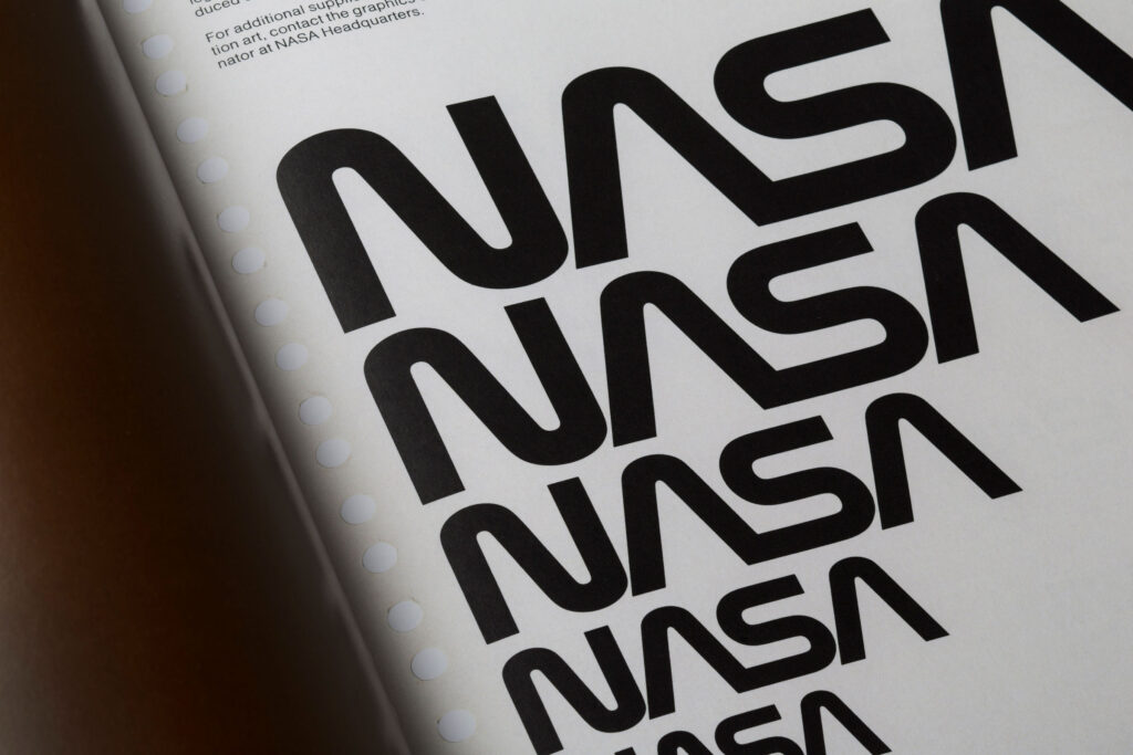
Brand style guides can vary in size from a couple of simple pages listing basic information about logos or fonts. They can also be gargantuan wonders, spanning upwards of 200 pages like The NASA Graphics Standards Manual, which, yes, even has guidelines about how to treat the NASA logo on spacecrafts and satellites.
Regardless of how many pages a brand style guide has, it’ll cover a few standard themes. Here are the most common ones:
Logo Usage
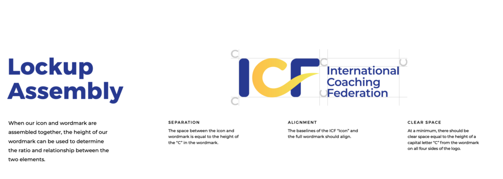
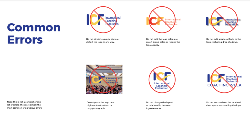
In this section, you’ll find guidance on using company logos. It can include details about text lockups, colors, sizes, and what it should look like in horizontal and vertical positions. In the case of the International Coaching Foundations’ style guide, they break down exactly how their organization’s logo should be used in various formats. But more importantly, they demonstrate common logo errors that deviate from the brand.
Color Palette
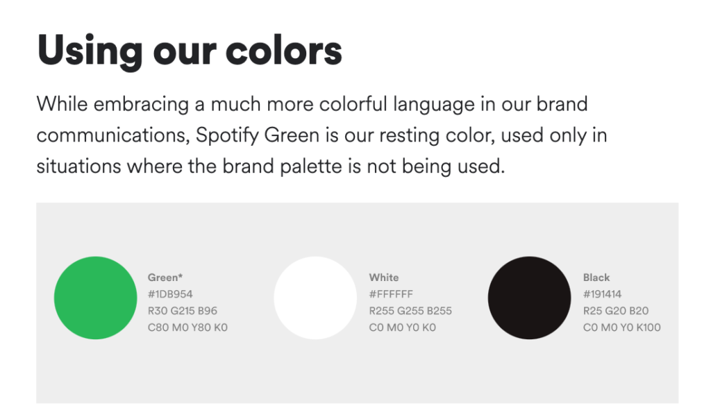
All of your brand’s colors will be shown and broken out into different swatches. Each swatch could include the numbers for print PMS or CMYK colors. It’s also common to add HEX or RGB values, which developers refer to. As an example, Spotify’s digital brand standards give readers instructions for their color palette along with other usage requirements.
Typography
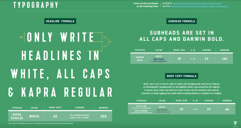
Instead of blindly picking random fonts, style guides also list the exact typefaces designers and internal teams would incorporate into headers, body copy, and other text shown in print or web. Some style guides even delve into more granular details about their fonts, as in the case of Royal Caribbean’s brand guidelines.
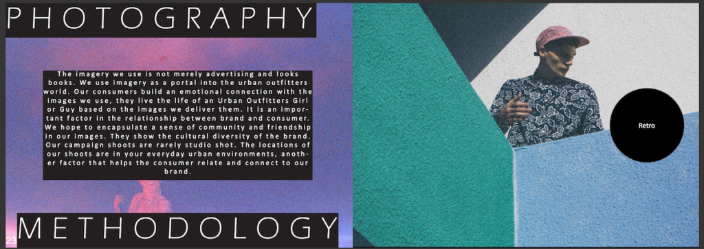
Image Usage
Style guides make it easy to choose images that are on-brand. Designers and other creatives can reduce the time it takes to source photos, making it easier to churn out sales and marketing pieces. Clothing brand Urban Outfitters photography guidelines state how their retro, everyday imagery helps their customers “live the life of an Urban Outfitters girl or guy.”
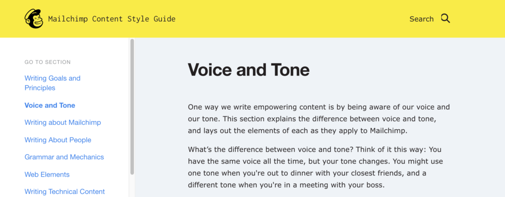
Tone & Voice
Each brand has its own personality and communication style. And establishing the messaging guidelines helps create a consistent voice for every application. Mailchimp’s content style guide gives readers direction about writing empowering copy for the brand. At the same time, they put their goals and values front and center, so people understand what drives the company.
By definition, style guides provide direct for internal teams and outside vendors like graphic designers, video production companies, and printers executing on a company’s brand. They produce everything from internal communications initiatives to digital campaigns, and these guidelines simplify the design and production process.
With the time between campaigns becoming shorter and shorter, templates based on an established brand style guide make it easier — and faster — to launch without having to recreate the wheel each time.
Businesses can serve branded content and promotions to different audiences and provide the same experience whenever they interact with the brand.
And when people hear your brand’s name, it should conjure up a distinctive image because you’ve spent the time and energy upfront creating a comprehensive style guide that anyone can follow.
If the past couple of years have taught us anything, it’s that parenting is really a 24/7 job, and it can be really tough to that while also doing your actual job. Thankfully, design is here to the rescue! At, least in the Henrico County Public Library. The building was due for a long-waited upgrade, so they asked their daily users what they would most like to see. One answer was overwhelming: to make their community feel welcome, they needed more accommodations for children. Visitors remarked that to use the computers, they would have to balance their children on their knee as they tried to work. Enter the design solution: a workstation that has normal accommodations for the adult computer user, as well as a children’s add on to keep them safe and contained, but able to be on their own while their parent works. The best part: this design is available for the home too!
Packaging design is one of our favorite things (both to do and keep up with), and we really like seeing examples that show it’s more than just a delivery method to get a product into the hands of a consumer. Packaging is an underutilized extra piece of your brand that you can design and customize to your heart’s desire. English chocolate company Cadbury (of the Creme Eggs fame) has a new packaging method that makes it easier for consumers to save what they don’t eat. Instead of opening the candy and having to eat it all because the thin wrapper is ripped to shreds (or because you just eat all the chocolate, all the time…), their new package can be twisted to easily save what you aren’t ready to eat. They’re testing it out with the Duos bar, but we’re sure this will take off!
…not something you’re used to hearing, is it?! This new game actually encourages players to “touch” the (digital) artworks in this museum. Each art style has its own gameplay and rules…the catch? You figure out the changes by trial and error, there aren’t instructions! However, this game isn’t meant to frustrate: there are no time limits, and if you get stuck, there is an option for a hint to get yourself back on track.