This is the content.php article

When we think of standardized color swatches today, we automatically think “Pantone”. If you’ve followed us here at KEYLAY for awhile, you’ve seen our graphic designers make lots of posts about Pantone, but Pantone is hardly the first collection of colors! More than 100 years ago, Werner’s Nomenclature of Colours arrived on the scene, most notably used by Charles Darwin in his travels on the H.M.S. Beagle. So next time you see one of Darwin’s drawings, you’ll be able to pick out “sap green” and “veinous blood red”. You’re welcome.

This is the content.php article

End-of-year wrap-up lists are a common sight in different publications throughout the month of December, and Digital Arts delivers one that’s right down our alley with their biggest logo redesigns from 2017. Some of the current logo redesign trends include simplistic icons that work on small digital screens, usually vector-shaped with a legible typeface and bold colors.


f1_newlogo
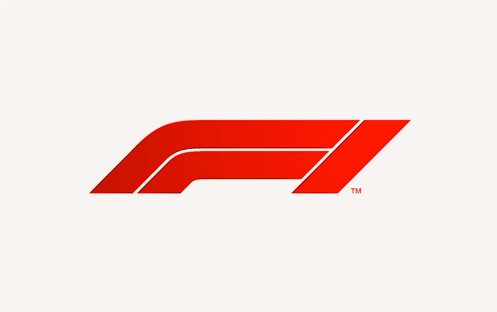
Formula 1 underwent its first major redesign in 23 years. Notice how the new logo resembles the shape of a Formula 1 car? “The new mark aims to embody the core forces of Formula 1 racing: speed, attack, and control; while its sleek, sharp interlocking components celebrate the technical prowess of Formula 1 engineering teams,” said the logo’s designer.


https://youtu.be/qqo9kTRscKQ
Or check out Apple Music’s brand identity video they released last month, with different variations of the popular musical note of the logo front and center throughout.


youtube_old_new_logo

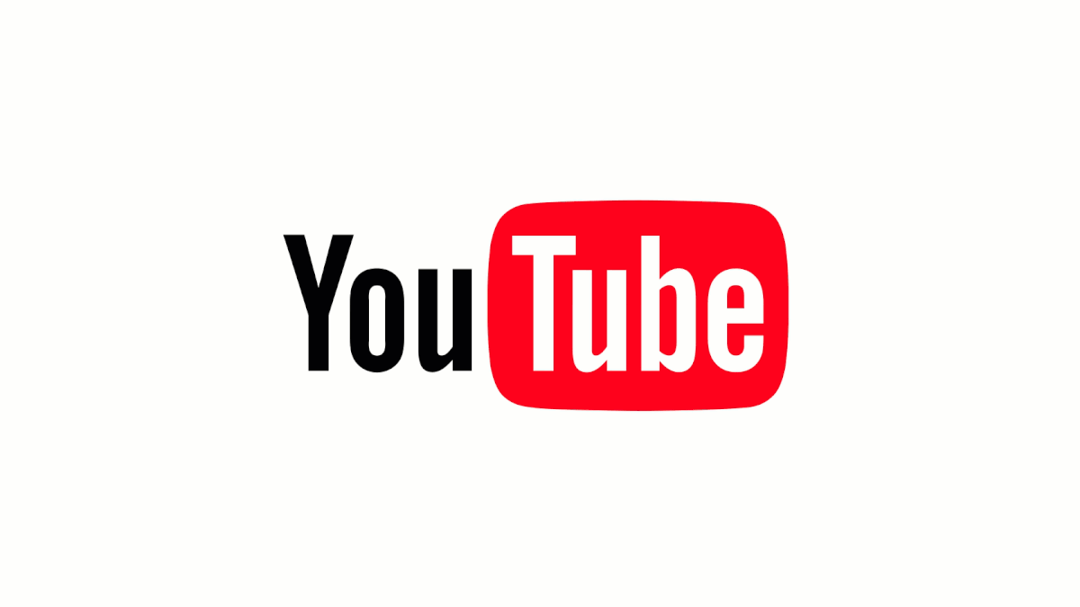
Did you notice YouTube’s slight logo refresh back in August? The red “tube” which wrapped around the word was moved to the front of the wordmark, and they turned it into the more recognizable play button.

There are several other interesting examples throughout the article. This goes to show how aggressive companies are about keeping things fresh to stay ahead of the curve. Might it be time to think about a logo refresh for your business?

This is the content.php article

All those billions served at McDonald’s ordered different meals, but they all have one thing in common: they created a lot of waste after the fact. From the shipping packaging to get the ingredients to stores all over the world, to the paper and plastic that comes in through your window, there’s no doubt that fast food creates a lot of waste. McDonald’s has promised to use 100% renewable, recycled, or certified materials in their packaging, from start to finish.

This is the content.php article

Once upon a time in 2011, graphic designers making a logo for a little company called Starbucks Coffee created a logo that was too perfect, too beautiful, it was uncanny and frankly, unsettling. Ultimately, the team at Lippincott decided that the perfection–ostensibly what every designer is shooting for–was actually making the brand too hard to connect with. Humans aren’t symmetrical, and to make the siren look more, well, human, she needed to have a few flaws herself.

This is the content.php article

It can be hard to see just how our favorite brands have evolved, but thanks to an archived page at apple.com, you can see one example of a web design blast from the past! The support page for the Apple G3 likely hasn’t been updated in a decade, and it’s fascinating to see the differences between the old and the new.

This is the content.php article

Not sure about you guys, but we were always told not to play with our food. However, these works of food art are a graphic designer’s dream and seem to be the exception! These intricate fruit and vegetable carvings are beautiful and skillfully done, especially considering how fast they need to be done before the food turns brown!