This is the content.php article

The British Army’s new recruitment campaign is causing eyes to roll for its use of what some are calling “derogatory slang” to attract millennials. But a writer for Digital Arts argues that’s actually a solid campaign if you’ve seen the commercial first.

Instead, many are only seeing the posters, which target “snowflakes” and “binge gamers.”

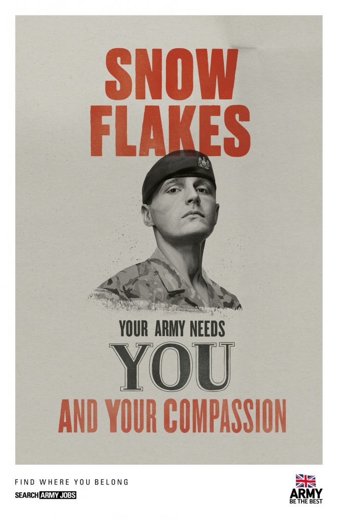
“The TV advert is realism-based and hits the key notes with its orchestral score, while the posters come across as snarky and desperate for attention,” the writer says.

The writer also praises the use of color, contrast and font, calling the illustrations of the soldiers “quite classy.”

Either way, execution is everything, and it appears this campaign hit the wrong notes.

Check out the story for more examples from the controversial campaign. What do you think?


Credit: MoD/Crown Copyright/PA

This is the content.php article

Being a professional creative is pretty great, we wouldn’t have it any other way! But the creative profession has some pretty specific interactions that you don’t really find anywhere else. New York-based designer and animator DeeKay has made an animation summing up some of these unique experiences. To graphic designers and other creatives, these are all too familiar!

This is the content.php article

If Google says, KEYLAY is one of the top companies in Atlanta, who are we to argue? The search giant reached out to us recently to share some stats about our website. They gave us a ton of information, and one cool thing we’ll say is that if you search for the top companies in the city, we’re right there on page one. We know things change all the time with Google’s algorithm, but for now, we’re happy to be at the top. 

This is the content.php article

Now, you can be the museum! MoMa and Uniqlo have teamed up to bring a limited edition range of fine art shirts to your closet. You can strut your stuff with your favorite artwork right on your sleeve. This limited edition collection is the fifth installment of Uniqlo’s annual ‘Surprise New York’ series.

This is the content.php article

Watching design evolve year after year is truly fascinating! This infographic compiles and points out the biggest changes of logos observed for 2019. Some of the changes are more of a subtle “big”, but all are equally as fascinating and important for the future of logo design.

This is the content.php article

You hear about “good design” all the time, but exactly does that mean? A good rule of thumb is to follow Dieter Rams’ 10 Principles of Design. Rams is one of the most influential industrial designers of all time, so he knows what he’s talking about! This scene from the documentary Rams lays out the goals of all designers for us, and is beautiful to boot!