Most sports leagues have started gearing back up after a prolonged break due to the coronavirus pandemic. And due to the shuffled schedule across multiple leagues, more teams from different sports are playing at one time than ever.
One day in September, for the first time ever, all the major pro sports leagues had a game occur on the same day.
That got us thinking about the teams from our beloved hometown of Atlanta! Specifically — because we love all things design, of course — it got us thinking about their logos and how they came together.
So we decided to dive in, starting with those Dirty Birds themselves, the Atlanta Falcons.
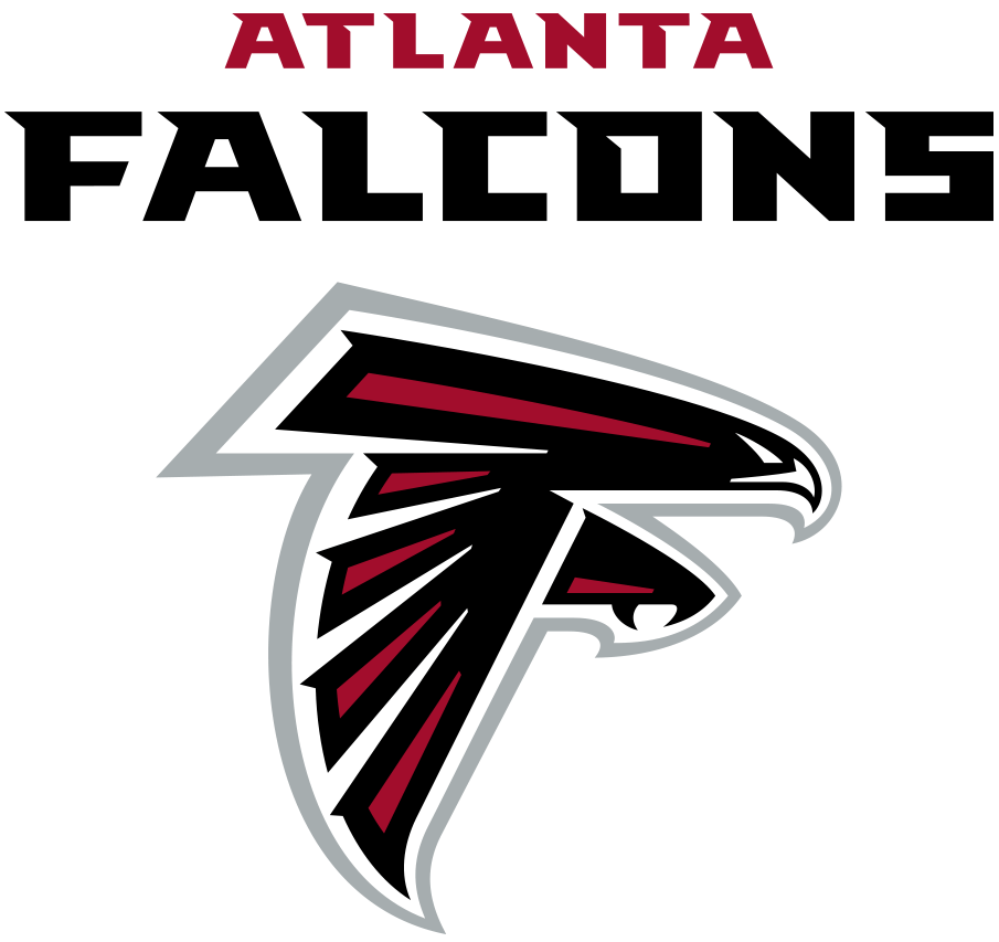
Falcons Logo Takes Flight with Nod to History
It took the Falcons 33 years after the team was founded to update its logo, and they wanted to make sure they got it right. A lengthy research process included conducting focus groups, polling fans, and giving Falcons players, coaches, and staff a chance to weigh in.
The initial logo design was a black falcon with a red outline, and the falcon’s head and talon protruded from its body to form the letter “F.” The new logo was more modern and sleek, with the falcon appearing to be in flight. Red and silver accents were added while still keeping the signature “F” design.
“The new Atlanta Falcons logo is fresh, strong and dynamic, and yet appreciates the tradition and history of this franchise,” said Falcons owner Arthur Blank at the 2003 unveiling of the logo. “The new logo depicts a more powerful, aggressive Falcon – one of fast movement. It is also representative of the evolution and direction of our team.”
The new logo was the work of graphic designer Mark Verlander, who has worked with the NFL on several other designs. Verlander told The Sports Design Blog that he felt “a tremendous sense of responsibility to respect the iconic history of” the original logo.
We know the feeling, Mark! It’s always important to keep in mind the history of a brand while considering how to update it for its next chapter.
Graphic designer Brandon Moore reviewed the logo on his blog Graphic Language (clever name!).
“From the big picture concept down to the last detail, everything has been considered and drawn to suggest speed, power, and movement,” Moore wrote. “Opinions vary wildly, but it is as close to perfection in logo design I can point to in the world of sports.”
We couldn’t agree more and are proud to have this logo representing our hometown NFL team going on nearly two decades now.
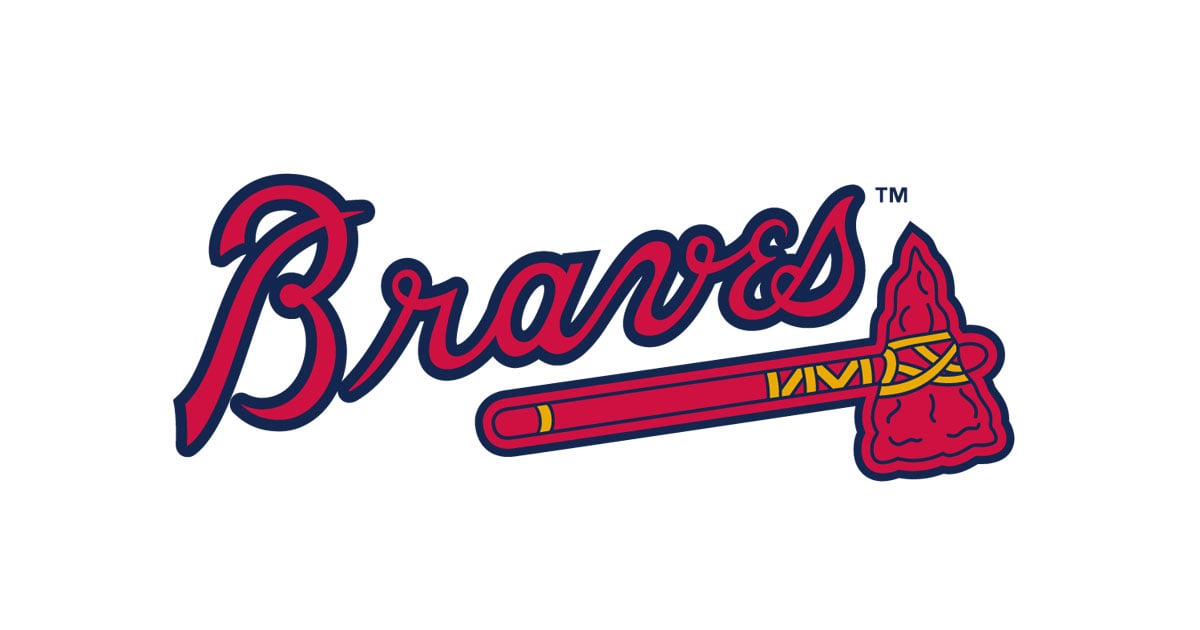
Braves Logo Sparks Different Conversation
The changes to the Atlanta Braves logo over the years have occurred partly over concerns about cultural appropriation, adding a different wrinkle to this logo’s story.
When the Braves moved to Atlanta in 1966, they kept the club’s existing logo featuring a Native American man with a mohawk and feather in his hair who appeared to be laughing, screaming, or shouting. The only change the Atlanta club made was adding the word “Braves” underneath it.
The Braves made a major redesign in 1990 by removing the Native American man, which many deemed offensive. But they stuck with the same font for the “Braves” portion of the logo, enlarged it, and added a tomahawk underneath to symbolize throwing accuracy and force.
Subtle changes had been made to the logo since the redesign 30 years ago, but the essence remains the same. The current logo has a red and blue design with a gold rope around the tomahawk.
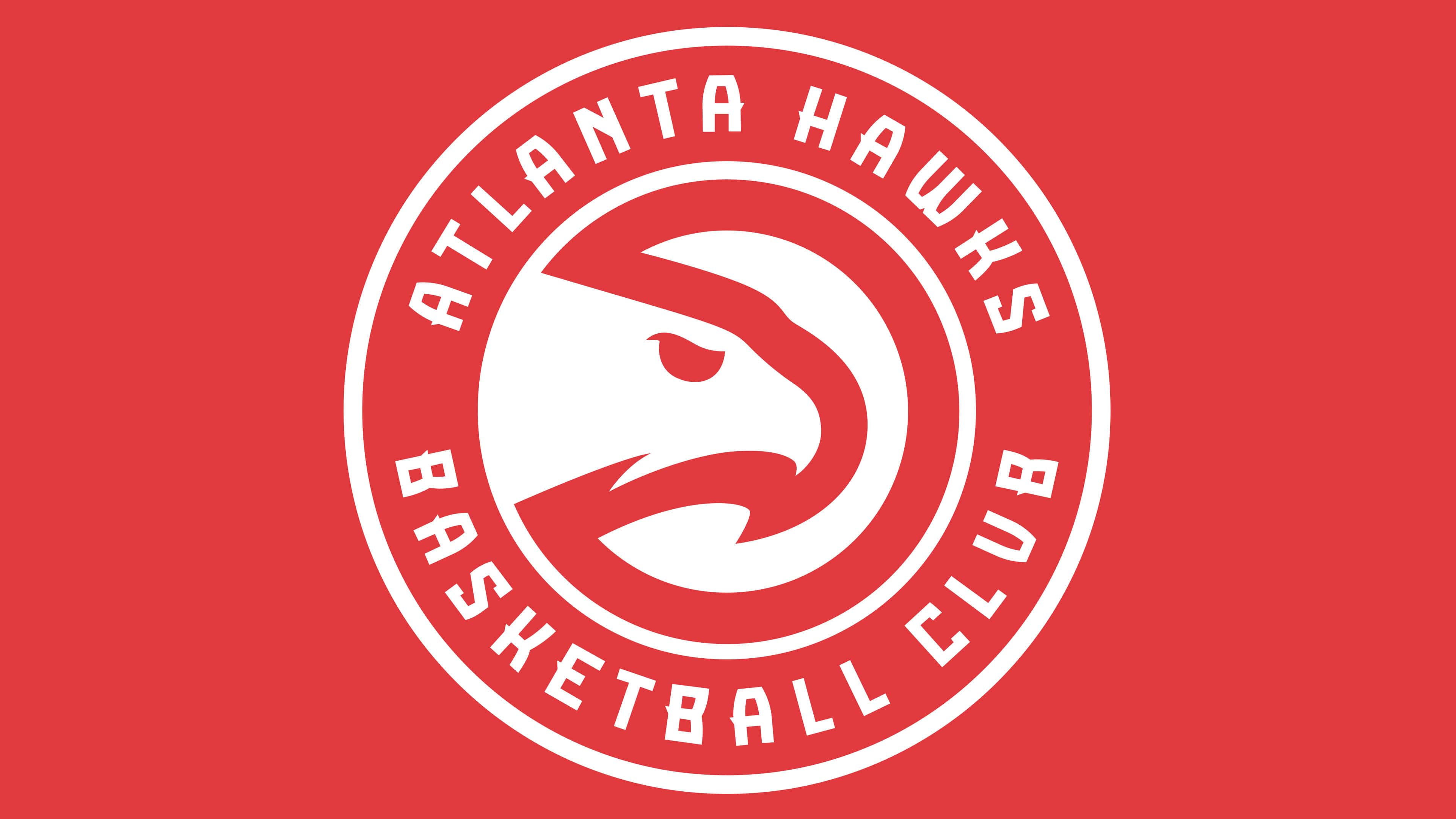
Hawks’ Throwback Move Pays Off
Nostalgia can be a big part of being a sports fan. They like to remember teams and players of years past or the teams they followed as a kid when it seemed like it was the most important thing in the world.
To that end, the Atlanta Hawks looked back when they decided on how to move forward with their logo in 2014.
From 1972 to 1995, the Hawks’ logo was known as the “Pac-Man logo.” If you looked at it one way, it was the silhouette of a hawk’s head inside a partial circle, look at it another way, and it looked like the classic video game character chomping down on a dot.
Well, after nearly 20 years away from that design, the club announced in 2014 that it was revising and updating the Pac-Man design to use as a secondary logo. The new version looked more aggressive, with a sharper hooked beak, a more predatory angle for the hawk’s head, and a fiercer-looking eyeball.
Fan reaction was off the charts! The club set merchandising sales records for anything carrying the iconic throwback logo. That’s why the following year, they adopted the new Pac-Man design as its primary logo, encircled by an “Atlanta Hawks Basketball Club” wordmark.
That last addition was very strategic in terms of a branding perspective.
“The addition of the Atlanta Hawks Basketball Club to the logo is just as meaningful as it speaks to our belief system that an inclusive and welcoming culture to all Atlantans is the only way to truly be a successful franchise,” Hawks CEO Steve Koonin said at the time.
Coonin added that the “Basketball Club” designation reflected the team’s commitment to improving the quality of the fan experience, building an emotional connection with the fanbase, and maintaining an inclusive environment for all.
This is one of our favorite “new” Atlanta sports logo projects we’ve enjoyed watching come to life.
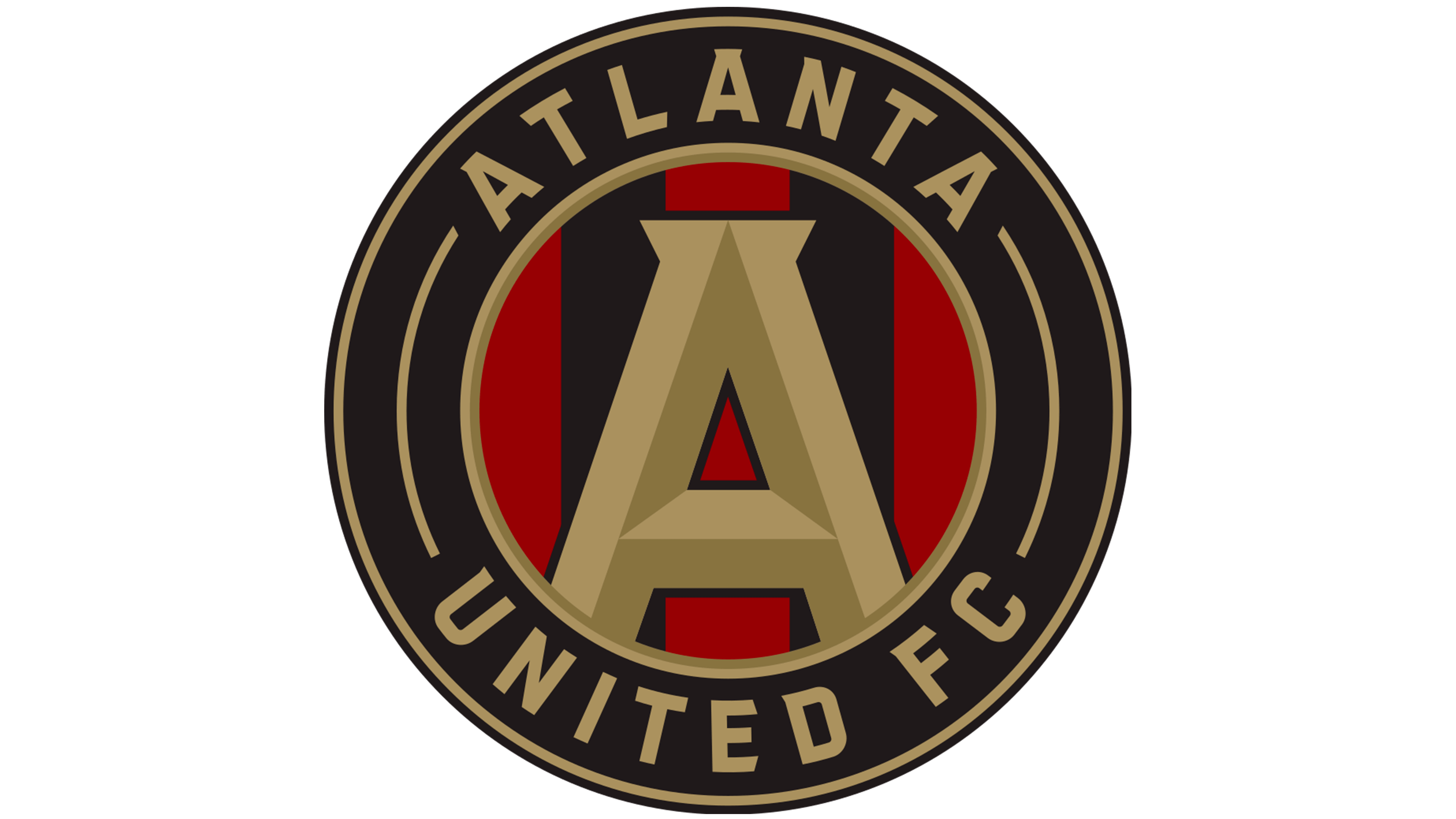
City’s Newest Sports Sensation Ties it All Together
It was like Atlanta United was shot out of a cannon when the team began playing in 2017. The entire city embraced the club, and you can’t go a block without seeing a United flag hanging outside someone’s house or business. United shirts and jerseys are ubiquitous.
And so much of that is due to the design choices made for the club’s logo.
The club debuted the logo in 2016. As you can see, it features a gold “A” on top of red and black stripes, with two gold circles on the borders.
“It’s a strong logo,” United owner Arthur Blank said at the time. “It represents Atlanta, which is what we wanted to pitch. It’s very compatible with other logos you might see in soccer, nationally and internationally.”
But it took tons of research and opinions to get to that 2016 logo debut. It was designed by Adidas, who put together thousands of designs for the club’s leaders to review over a three month period.
The gold seal was a nod to the city’s seal and to its history of hosting the 1996 Summer Olympics. The golden ‘A’ was included to focus on the enduring strength of the city, with the ‘A’ anchored to the circle to symbolize its connection to the community.
The logo’s five stripes represent what the club considers the pillars of the city’s character: unity, determination, community, excellence, and innovation. And the black stripes are a nod to the city’s history as a railroad town.
Local graphic designer (and United superfan!) Enrique Alvarado rated the logo with an 8 on a 10-point scale, singling out the color scheme as a major plus. We agree and might even inch that score up to a 9 out of 10. It’s a logo and a club that we’re proud of in the city we love and call home.
If any of Atlanta’s pro sports teams decide to do another logo redesign, we’ll be sure to break it down with you in a future blog post!