This is the content.php article

We love packaging and graphic design, so this one is right up our alley! And may also show our age, but whatever. VHS boxes used to be right up there with album covers for showcasing art that may or may not have all that much to do with what’s inside. Back before you watched everything on streaming with a tiny thumbnail you can hardly see from across the room, the VHS box had to grab your attention and hold it long enough for you to choose to buy or rent that movie. They were a nicely packaged chance for the distributors and designers to get the feel of movie across to their intended and hopeful audience. VHS tapes were the first time you could watch a movie on demand in your home, without commercials or being broadcast, and it was the wild west as far as design went!

This is the content.php article

Storytelling greatly impacts how we feel about brands. It affects how we think about certain beverages, foods, clothing, and even household items. Studies have shown that our enjoyment of these products is often affected by their branding.

But it’s not just the brand messaging that matters. It’s the visuals. We want to see ourselves reflected on the page and in the stories told by businesses.

And for companies, it means using imagery to introduce people to the brand and enable them to embrace it. Here’s why visual storytelling is critical for building connections with customers and how your brand’s visuals can make them feel included in your narrative.

The importance of visual storytelling for brands

Whether it’s a print ad or a social post, the photos and illustrations used by your business have to reflect the audience viewing them because self-image influences how buyers feel about brands.

It’s personal. People want to feel good about the products they buy. And they want to use them to express their interests and personality.

For instance, outdoor clothing companies like Patagonia, Columbia, and REI provide high-performance gear for people who enjoy hiking, camping, skiing, and other outdoorsy activities. The imagery they use in their marketing creates a visual story for viewers full of energetic people, lush nature, and actively protecting the environment.

It’s so strong you can almost hear the ground crunch under your feet as you view their photography.

Buyers of these products can feel like these brands understand them because each company’s visuals mirror their lifestyle and values.

Using brand style guides for visual consistency

Style guides give the people creating assets for the company direction about utilizing each brand element. These guides can be a simple, one-pager, or multi-page book full of use case examples.

Every photo, graphic, or illustration has to remain consistent with the brand’s established tone and personality. When providing creative direction for images, brand style guides explain which types of visuals should be used and how.

Going back to our example about outdoor clothing companies, would it make sense if they suddenly used dark, moody photos set in the city? No. This sudden change would be considered off-brand and not representative of their target audience.

Style guides are necessary to break down a brand’s identity and ensure the visual story it tells is whole and consistent.

What are common pitfalls to avoid in visual storytelling?

The imagery used by brands can draw people in or push them away. Here are a few traps to avoid insulting or enraging your audience.

Irrelevant or misleading imagery
When images don’t align with your company’s products or services and how they’re used, it confuses your audience and can mislead them. Show people what they can expect from your brand. And if you make a mistake, apologize.

Stereotypical images
Incorporating photography or illustrations into your advertising or marketing that show your audience in a negative light tells them two things. 1) You didn’t do your research, and; 2) You didn’t care to try and understand them.

You want to be memorable for representing your customers, not misrepresenting them.

Lack of diversity or representation
One of the quickest ways to lose someone who could be a potential customer is to create marketing campaigns that don’t show other people who look like them. This can include race, gender, and other defining attributes such as able-bodiedness.

For example, the representation of disabled people in marketing is still a work in progress, as only 3% of ad spend goes towards showing this group even though they have enormous spending power.

Insensitive or offensive imagery
This doesn’t need to be said, or maybe it does, but you don’t want to include anything profane in your brand’s visuals. Sometimes things move fast when launching a new ad campaign, but it’s not an excuse to put out objectionable content.

Do your research ahead of time to address any cultural or ethical considerations that could affect how your audience views your brand.

Using visual storytelling to create brand affinity

Brand affinity starts by making people feel included in the story told about your company’s products and services. When people see themselves in this story, they’re more likely to buy from your brand and tell others about it.

The imagery used by your brand not only shows people who they are and what they aspire to be.

As trends and social norms change, your brand’s visual story will have to adapt and evolve with them so they continue to reflect your customers. Treat them with dignity and respect, and you’ll gain their loyalty.

This is the content.php article

Over 30% of companies conduct their business online, giving them a competitive edge over competitors slow to embrace digital marketing. This can be especially beneficial for small companies planting seeds to increase brand awareness and revenue.

Concentrating on your business’s key performance indicators (KPIs) is significant in measuring your marketing and taking people from unfamiliar with your products to championing them.

But first, what do brand awareness and KPI even mean?

Here’s a quick refresher on brand awareness. This term describes people’s familiarity with your business’s products and services.

The marketing tactics you choose and the key performance indicators applied to them can give insight into what people think about your business, the industry and what they want to see from both.

Your KPIs serve as a gauge to measure how well your marketing is or isn’t working to achieve your objectives. The SMART goal method is commonly used to help define them.

In this instance, your KPIs would need to be:

Specific – Clearly defined goals laid out.
Measurable – Trackable metrics evaluated over time.
Attainable – Achievable objectives you can reach.
Relevant – KPIs make sense for your business goals
Timely – Have an exact timeframe to observe KPI progress

But for now, we’ll focus on the KPIs that make sense for brand awareness.

Website traffic

Tracking the amount of traffic coming to your site is one of the top metrics for small businesses to pay attention to. It shows how many people are coming to your site and also answer questions like:

  • – How long did visitors stay on the site?
  • – Which pages did they visit?
  • – Are they finding what they need to learn about the business quickly enough? Or did they bounce right away?

Several free and paid tracking tools are available to answer these questions and more. Here are a few of the most popular ones.

Google Analytics: Google is by far the largest search engine, and with the latest release of Google Analytics 4, it’s easier to track traffic and engagement through this web reporting tool. And the best thing is that it’s free!

Adobe Analytics: This powerhouse analytics tool measures and reports user journeys across multiple channels and platforms. Adobe Analytics is a paid tool providing more advanced data analysis to create a better experience online.

Fathom: Fathom is another paid tool similar to Google Analytics. However, it prioritizes user privacy. You can track a user’s behavior on your site without exploiting their personal information.

Using these tools reveals the pages that accomplish your on-site goals and those that do not. They also show how people find your business and discover your content.

Search engine visibility

In the early 2000s, many websites stuffed their pages full of keywords to rank higher in the search engines. You were almost guaranteed to increase your site traffic and brand recognition if you reached the top.

Search engines like Google penalized sites for this practice as the internet evolved. Now they prioritize websites optimized for user intent.

Tools like Google Search Console, Moz, and Semrush provide incredible data about which keywords people use to find your site, which you can incorporate into your marketing strategy.

MarketMuse is another tool to create and optimize your company’s content so people can find it online. This software also exposes topics and keywords your competitors aren’t covering.

Search engines reward valuable content and authoritative sites. As you create better content and gain more backlinks, you’ll be able to see which keywords and content are bringing people in.

Social media engagement

Social media is an inexpensive way for businesses to expose their brands to new audiences. However, where many companies slip up is by placing a heavy emphasis on the number of likes and comments they receive on posts.

It’s a missed opportunity to create engagement that turns into brand advocacy and sales.

Some metrics to measure for social media engagement include:

  • – Tracking post performance (likes, shares, and comments)
  • – Post performance by type (text, image, video, animated)
  • – Audience growth (new followers or subscribers)
  • – Conversion rates (website or landing page visits, email subscribers, etc.)

Social media business accounts from the largest platforms provide basic analytics about follower engagement. It might not be very robust, but it does provide a starting point to understand how your content resonates.

If you want all-in-one scheduling and reporting tools, Social Sprout and Hootsuite are among those helping businesses build their communities through content.

Content reach and engagement

When your company’s video or blog post goes viral, it reaches a broader audience, leading to more exposure and brand awareness.

A couple of metrics to evaluate when measuring your content reach is to look at the number of times your blog post, video, or other digital media was viewed or shared.

Next, you want to see if there was an increase in people taking action to learn more about your brand. This could include more email newsletter subscribers, website visits, or social media followers.

As more people are introduced to your brand through your content, you’ll pull them deeper into your marketing ecosystem.

Partner collaborations

It’s common for small businesses to partner with companies providing a complementary product or service. This practice is an opportunity to cross-promote offers and share audiences. It can be especially appealing when the goal is to expose your brand to a new group.

Tracking the metrics for these partnerships involves a lot of transparency and trust on both sides. Before embarking on co-branded campaigns, each party must establish what the assets will look like and what data they’ll share with one another.

Some metrics tracked for these types of campaigns could include reach, engagement, and referral traffic stats. If you’re on a partnered email campaign, you want to gain access to the list of new subscribers so you can continue marketing to them in the future.

Increasing brand awareness through your KPIs

Exposing your brand to new audiences means tracking the success of your marketing efforts. As a small business, observing whether you’re meeting your KPIs helps you make better choices about where to invest time and resources.

This makes refining your strategies easier and gives potential customers reasons to want to experience everything your company offers. But more importantly, it gives your business a way to measure your brand awareness campaigns and create a path for people to continue their journey.

This is the content.php article

Direct mail marketing. Is it still viable? Heck yes, it is! On average, the engagement rate for direct mail hovers around 95%.

And when done well, it can have a decent ROI for businesses because people tend to find it way less intrusive and easier to process than email.

So let’s examine why physical mail is still an effective tool for businesses across multiple age demographics, especially older generations.

Direct mail is still a hit with adults

Unsurprisingly, most households receive a lot of mail each year. According to a US Postal Service study, most American homes get around 454 pieces of mail per year. Contrary to popular belief, most physical mail isn’t tossed in the trash.

It’s read, kept, and reread.

One Gallup poll showed 41% of adults check their mail every day. This form of communication can be a welcome relief in a world where people feel increasingly overwhelmed by their digital inboxes.

And when a highly targeted, relevant piece of mail lands in someone’s mailbox, they’re more likely to pay attention.

The same Gallup Poll also revealed that those who are part of Gen Z and baby boomers look forward to getting physical mail, especially when it’s personalized. For Gen Zers, receiving Insta-worthy correspondence and packages from businesses encourages this group to post them on social media.

But this type of engagement with direct mail goes beyond Zoomers and baby boomers.

A generational study by USPS, spanning multiple age groups, revealed a few surprising revelations about people’s reactions to mail and how it affects their buying habits.

Gen X and Millennials notice and appreciate when businesses send customized, branded mail, including those containing free samples, thank you notes, and distinctive packaging.

Baby boomers respond most positively to receiving physical mail. However, they’re less likely to care about design or extra elements added to them.

How different demographics respond to direct mail

Across the board, the USPS study showed that Zoomers, millennials, Gen Xers, and baby boomers care about relevance—the more relevant the direct mail piece, the higher the response rate.

And here’s what each group will most likely do once they get one of those mailers.

Gen Z
Gen Z is considered to be the most digitally connected demographic alive today. But they still appreciate getting physical mail from companies. They’ll check out those businesses online before deciding whether to buy when they receive something that catches their eye. One of the biggest things they respond to is messaging around a company’s environmental and sustainability values.

The study also found that even though Gen Z has mixed feelings about retargeted direct mail, they’re receptive to getting it based on their online behavior if it’s pertinent to them.

Millennials
This group cares deeply about authentic connections. And when companies communicate their business philosophy and values, 70% of millennials feel more positive about them. Millennials are also the most prone to visit a business website or brick-and-mortar location after getting a piece of relevant mail.

They also like to share. When millennials get an interesting offer, they want to make sure others in their circle know about it by sharing their findings on social media or through word-of-mouth.

Gen X
Before mobile devices took over, this generation remembers what it was like to send—and get—handwritten letters and cards. And they still get a kick out of it.

Gen X tends to be more drawn to physical mailers and repelled by email offers, often deleting or tracking them as spam. However, when a call to action in the physical mailer makes engaging with a brand online more convenient, this age group is more open to a company’s sales offer.

Baby boomers
Baby boomers generally care less about pretty packaging and sharing mailers online than their younger counterparts. They want substance and recognition, and appreciation.

Out of the four age groups, baby boomers would be the most disappointed if they never got another piece of mail again.

To them, opening a piece of mail is considered a much more personal experience than email. When businesses contact them through direct mail, baby boomers are likelier to engage with them over the phone or in person than online.

Using design and personalization to connect

Each age demographic enjoys getting something in their mailboxes but responds differently in their buying habits. Meaning businesses have to make their direct mail campaigns hyper-relevant and personalized to increase their ROI using this medium.

The response rate for direct mail can fluctuate based on the number of mailers in a campaign. But other factors can also influence it, like:

List quality: Your list can lead to a successful direct mail campaign or tank it entirely. With a clean, targeted, up-to-date list, you can create messaging and offers people want to see because you aren’t relying on a scattershot approach.

Retargeting: Zoomers, millennials, and Gen X are more receptive to getting mail based on their online behavior. Retargeting can be a very effective way to get more people to buy. However, it has to feel authentic to the messaging and offers provided in the direct mail your audience sees.

Design: Bright colors, unique paper, and unconventional-sized mailers get attention and are opened. Direct mail campaigns that surprise, delight, and use clear visual calls to action are more likely to get people to act than sticking with generic designs.

Direct mail is alive and well

As a marketing tool, it’s safe to say direct mail is indeed not dead. Physical mail can significantly drive business sales when paired with a deep understanding of your audience and other tactics like retargeting.

Acknowledging the differences between age demographics gives you insight into what each considers meaningful. Gen Z has completely different motivators than baby boomers, millennials, and Gen Xers.

Creating direct mail campaigns with this in mind can help you provide your audience with more targeted messaging and designs that get them interested in your business.

This is the content.php article

Conversion rates for funnels can vary for several reasons. But when its creative components visually align with buyers’ expectations, you can build trust and increase the chances of converting them as they move through it.

When design is an afterthought, it affects how the pieces of your funnel resonate with customers. Creating well-designed, on-brand assets within it enables you to give current and potential customers a consistent experience.

Here’s how to use design to ensure your funnel assets make the buyers’ journey smoother.

Empathize with the people in your funnel

Marketing funnels can be as simple as a landing page with an accompanying thank you page or as complex as a multi-stage, triggered email sequence that includes lead magnets and retargeted ads.

As you test, optimize, and refine the assets for your funnel, the insights gathered from your customers will be vital to understanding what emotional and psychological factors lead them to take action—or not—within your funnel.

Good design empathizes with the person on the other side of the screen. Businesses can use graphic design to show prospects their values match theirs, leading to ongoing sales, recommendations, positive associations, and affinity for the brand.

What should good funnel assets look like?

Like most businesses, the main goal is to attain high-quality leads and turn them into customers. As people become increasingly inundated with marketing content, they don’t have patience for companies that don’t know them.

Good funnels offer value throughout the journey by putting the customer front and center. They also use graphic design to organize information efficiently and creatively so people can experience what the brand provides throughout their marketing and sales ecosystem.

Designing your content

Content is king, but the design is its crown. A 2021 Demand Gen report found that 79% of buyers stated that a business’s site content impacted whether they made a purchase.

Graphic design organizes this content to move people down the page toward the call-to-action (CTA) and will:

– Be easy to navigate and only contains the messaging and design elements needed to guide people down the page.
– Use a clean design with a distinct visual hierarchy and clear delineation between elements.
Maintain consistency between colors, typography, and other brand components.
– Include an easy-to-find call-to-action that tells people exactly what to do as the next step.
– Be optimized for mobile devices since 58% of traffic comes from people using them.
Compress images so they don’t weigh down the page and decrease load time.

When used together, these little details create a user-friendly page that helps increase conversions on landing pages, emails, and websites.

Highlighting social proof

Testimonials and other social proof are essential for building trust, especially for high-value products and services. But sometimes, businesses may not put them on the page with design in mind.

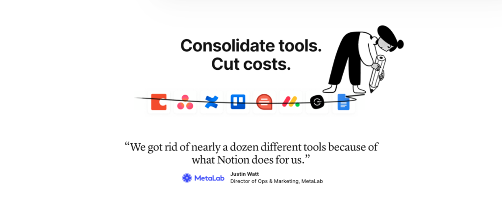
Project management site Notion has a powerful tool that helps teams keep all their work in one place.

Notion-homepage-screenshot


However, because their brand has a minimalist design, their homepage suffers from their social proof being hidden. If you’re scrolling quickly down the page, you could easily miss the testimonials sprinkled throughout.

Notion-testimonial-homepage-screenshot

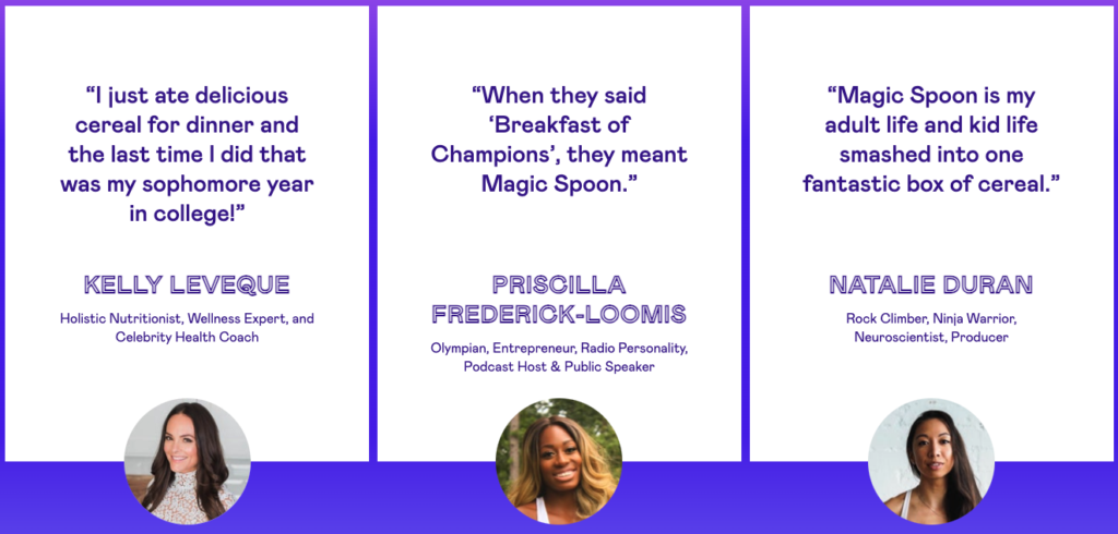
As another example, the breakfast cereal brand Magic Spoon uses color to separate their social proof.

Magic-Spoon-Media-Testimonials

People can easily see what others say about the company as they move through the page. The unique fonts and animated lines draw attention to each testimonial, so they can’t be ignored.

Optimizing your calls-to-action

CTAs lead to higher conversions when they’re clear and direct, taking the anxiety out of moving on to the next step. Here are a few best practices for your CTAs:

– They shouldn’t be surrounded by any distracting text or graphics that compete with it.
– Your CTAs need to include text around it that alleviates any hesitation, such as guarantees or benefit statements.
– If multiple calls-to-action are on the page, each must relate to the other and the business goal you’re measuring.

And as for where to put the CTA?

You’ll have to test out different areas on the page. CTA buttons are among the most tested elements on landing pages and websites. Sometimes, putting it below the fold can lead to higher conversions than using it above.

Design and funnels unite

Your ads, landing pages, social posts, videos, and other funnel assets take customers through your products and services. Each one of these assets needs to incorporate good design principles and user experience to make a positive impression on buyers.

People want to feel like your business’s experience is custom-made and designed just for them. By keeping design at the forefront, you can create and optimize your funnel’s assets to keep customers happy and increase conversions.

This is the content.php article

What if you’re the only marketer at your company with a weekly, daily, and hourly to-dos list that only grows longer?

You can’t do everything on your own, and there will be times when you have to bring in outside help that works with you to pull together powerful marketing. And when you partner with an external resource—like a creative agency—they can bring fresh, new perspectives to the game.

Perspectives that are insightful, strategic, and still innovative.

Here’s a breakdown of the steps agencies like ours take when working with marketers to develop a marketing piece from start to finish.

Step 01: Discovery

Before getting to which colors to use or looking at what your competitors are doing, we want to know this:

“What is happening in your business that made you come to us?”

The success of a design isn’t measured by how nice it looks but by how close it reaches the goals set forth during the initial conversations between you and the creative team.

Answering the question above gives everyone a clearer view of the goal we’re all working towards and usually reveals some of our marketing clients’ most significant problems. The most common ones center around off-brand marketing, missed sales opportunities, and outdated branding.

From there, we begin to look at your business’s landscape to understand where you are in the industry.

  • – We check out what your competitors do in their online and offline marketing.
  • – Review past campaigns and ask questions about the reasons why they did—or didn’t—succeed.
  • – Assess what customers think and say about your business and its creative.

Once we get this information and wrap our heads around your business, it’s time to start designing emails, direct mail pieces, and other marketing pieces that connect with customers.

Step 02: Design and Refinement

The process is the same, whether it’s a brand redesign or a brochure. All of the insights gathered during the Discovery process influence the project’s creative and strategic direction, resulting in several rounds of design produced internally before it’s presented to you.

Here’s how it works:

  • Mockup creation: Our designers begin by laying out several designs based on the creative brief provided, which you and your agency contact agree upon before the project starts. The mockups created by the designer get refined before being presented to the creative director for review.
  • Internal creative review: The creative director and other team members point out any areas needing improvement and ensure the design aligns with the brief’s goals.
  • – Internal revisions: Once the designer gets feedback, they update the creative before it’s rechecked internally and prepared to present to you.
  • Presentation preparation: Each mockup is laid out in a digital deck so the design team can review it with you. This presentation includes key insights and objectives influencing the design.

Now, it’s time to share the first round. During this presentation, everyone can discuss the different options and narrow them down to one.

Step 03: Presentation

Reviews can happen in person, over a video call, or asynchronously. We’ve done all three types of presentations, and as tools like Loom, Visme, and Prezi have hit the scene, it’s reduced the amount of back and forth that comes with working on multiple rounds of revisions.

The presentation begins by restating the goals of the creative brief, so it’s clear where the design started. As we walk through each design option, we explain the thinking behind it, especially if the presentation happens asynchronously.

Then you and your team provide feedback about what does or doesn’t work for you, which happens during the presentation or is communicated later via email. Together, we work through the next steps and expectations for the following round of review.

Step 04: Revisions and Review

After consolidating all of your feedback, it’s brought back to the creative team so they can incorporate it into the next design round. We repeat the process outlined in Step 2 before you see it again.

Typically, this next round only involves bringing everyone together in the same room if necessary. Otherwise, the revisions are shared via email.

Step 05: Final Revisions and Implementation

If there are no other changes or minimal edits, we pass along the final files to your developer, printer, or directly to you. Sometimes, this process includes working one-on-one with other vendors to ensure the final design looks or operates how it should.

This could mean being more hands-on with:

  • – Going on press runs or reviewing press proofs to ensure colors, text, and imagery appear correctly.
  • – Checking digital assets, landing pages, emails, and websites to ensure they’re working correctly and look like the final approved design.

Being this involved with projects means that each design is given the care and attention they deserve to ensure everything is in the right place and strategically on point.

Delegation leads to successful marketing

Being the one everyone in the organization, everyone turns to for all things marketing can be frustrating. But when you partner with a creative team who serves as strategic thinkers and collaborators, it takes an enormous weight off your shoulders.

And frees up space for you to focus on the bigger things that increase revenue.

Working hand in hand with a team that understands how design, technology, and strategy come together, the demands of developing effective marketing campaigns is no longer a lonely journey—but a productive one.