If you’ve ever been to Iceland, you know the landscape seems otherworldly. The tourism board of Iceland, Visit Iceland, is taking that sentiment and running with it in a very clever campaign that advertises the amazing sights and scenes you can experience in Iceland. “Iceland. Better Than Space” is the message on their billboard…but there’s a twist: this billboard is in space! For a fraction of the cost, Iceland promises an out of this world experience, and this creative campaign has us sold!
Have you ever felt you were born in the wrong time? Well, MyHeritage, who brought you the AI-powered animation of old family photos we wrote about ahile back, is back with another AI tool: upload a couple reference selfies, and it will create a historical portrait of you through the ages! The tool is called AI Time Machine, and it’s pretty incredible. The really cool part is that the photos are based on historically-accurate paintings and photos, so no historically-incorrect horned viking helmets to be found here. The AI Time Machine is free for an introductory period, and becomes a paid service after, so go get your history on while you can!
You know we love a good out of the box creative campaign, and Philadelphia cream cheese is here with the newest one that’s caught our eye! If you wanted to gift a designer handbag for the holidays this year, but it just isn’t in the budget, Philadelphia has got you covered…kind of. The Philly Handbag is a kit of everything you need to make a high end handbag from scratch….out of cheesecake, that is! And it’s not just a pricey gimmick that will only be in select stores, this kit can be purchased on Amazon for under $20. Not only is this creative, it’s accessible! Excuse us while we go buy 3.
You may have seen our past post about how Adobe is removing the Pantone color books from their design software. We’ve been waiting to see how they were going to handle that going forward, and we’re disappointed to report that they plan to make users pay for Pantone swatches going forward. But from that disappointing news, we have a little bit of good news: artist Stuart Semple has created a free Adobe plugin that “liberates” blocked color books. Called Freetone, it reopens your Pantone color books and lets you continue your work without another subscription. There are only two caveats: no one who works for Adobe or Pantone is allowed to download the plugin, so if you don’t fit into those boxes, download away!
Have you ever seen a sign, or a logo, and been struck with an overwhelming need to know what font is being used? If so, first of all, you’re officially a designer, congratulations! And secondly, there’s a resource out there that might be able to answer all your burning font questions! Fonts In Use is a collection of, you guessed it: fonts in use in the real world! You can sort by industry, formats, and by a specific typeface itself. We can see ourselves using it to get some extra inspiration for a typeface we might be a little too close to, as well as just browsing and getting inspiration for new projects!
When customers don’t know what you stand for, it’s harder to overcome the conversation they’re having in their heads. Many consumers believe businesses are grossly out of touch with them and no longer care about their needs.
Because of this, companies face a big challenge: Demonstrating that their values match their customers—and doing it in a crowded space where everyone wants to have a voice.
But when defining your unique selling proposition to potential customers, how can you use design to communicate in a way that matters?
We have a few thoughts on that.
Use graphics and color to illustrate customer experiences
Consumers rank customer service as one of the most important considerations they pay attention to when buying. In a PWC survey, buyers were asked what experiences they would find valuable in the future and would be willing to pay more for.
By far, efficiency made the top of the list. But there was also overlap with convenience, speed, and friendly, knowledgeable service. All of which count toward forming positive associations with businesses.
Going into detail about your “top-notch” customer service is probably tempting when marketing to your audience. But people’s attention spans are short. You only have seconds to show them something that captures their interest.
It’s why we recommend using design elements like the ones below to show how you provide excellent customer service:
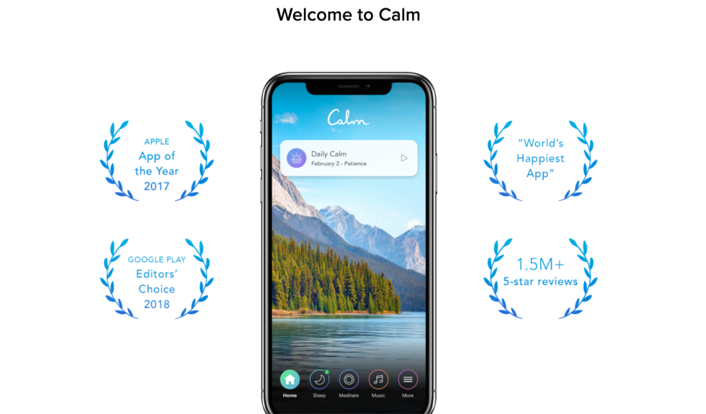
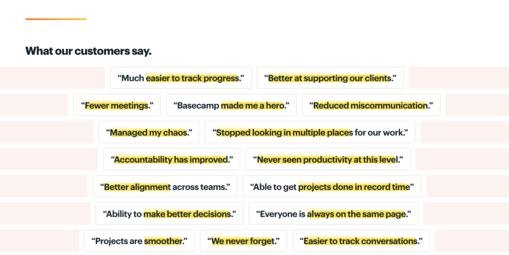
Presenting data using typography – These design elements, can help show customer-centric facts like the number of people served, certifications and awards. Typographic treatments can also condense important product or technical specs into a digestible format.
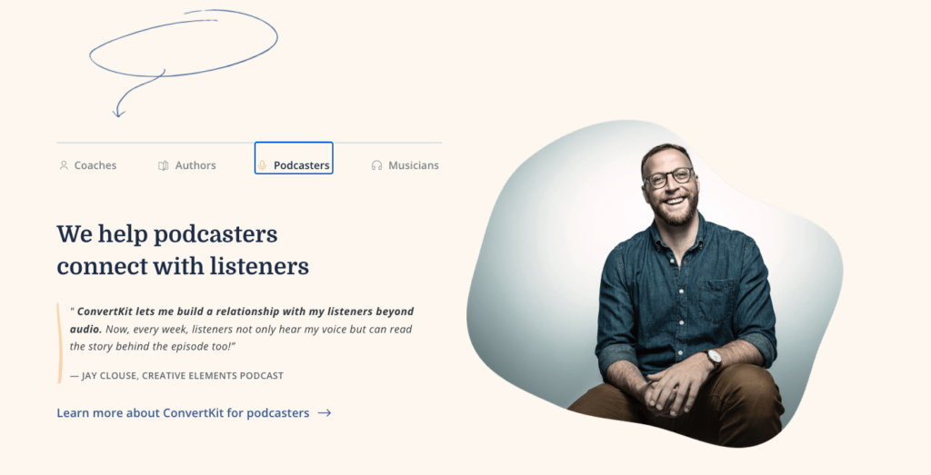
Highlighting testimonials with color – Most of the time, testimonials are located below the fold on a website or landing page. Adding a background color or vibrant graphics to this section draws the eye to these essential pieces of content.
Using small, graphic details to emphasize specific experiences – The human eye is attracted to patterns and shapes. Using them as a design element enables people to build associations with various customer experiences.
These design tactics enable you to highlight details about what future buyers can expect from your business. It also allows people to see themselves in the business, making them more likely to buy and feel invested in its success.
Simplify your content to leverage how your customers make decisions
Consumers spend more time researching online than in stores. When people decide whether to buy from a business, they dig deep to learn more about its products, services, and values—especially for high-dollar purchases.
As potential customers research your business, they’ll be on the lookout for any of the top factors that could deter them from buying:
– Poor experiences with employees
– Untrustworthy company
– Lack of product/service availability
– Inefficient technology and shopping experience
To prevent people from developing negative thoughts about your business as they research, you want to be proactive about showing your process. Video case studies provide the reputation indicators potential buyers are searching for. Trust signals are important for customers as they look at testimonials and other reviews.
If it makes sense for your brand, icons—think emojis and other symbols—can quickly indicate to visitors whether an experience, product, or competitive feature is positive or negative. Make your product and service availability stand out with fonts that complement your existing ones. Take it further by using traffic light colors to display your current inventory.
Buyers are more likely to abandon a purchase if they aren’t finding what they’re looking for. Relevance is key. Your graphic’s explanation needs to align with what prospective customers want to do.
Mirroring what customers care about
Customers care about how your products and services make life easier for them. Putting that front and center and talking about the problems your business solves makes a bigger impression on your customers.
Why? They can see themselves—and their life experiences—in what your company offers.
When you want to explain how your merchandise or services benefit customers visually, start by breaking them down into their simplest steps. Then take what you’ve learned about what they’re searching for and reflect it throughout your marketing using graphic elements that get people to act.
Doing this conveys the value your business provides to the people who matter most—your customers.