


A Match Made in Branding: The Synergy Between Typography and Your Logo
Jan 08, 2024
Fonts tell illustrative stories with soft curves, wild loops, straight edges, and assertive serifs. The fonts you use in your brand convey a lot about your business and its unique personality.
And it’s where unique brand identities and memorable logos are born. Through these structured and unstructured shapes, you can design a logo that truly reflects the character of your company’s brand.
Deciding which typefaces to use—and how—in a logo design can mean the difference between potential customers taking your business seriously or ignoring it altogether.
Let’s discuss a few ways to use fonts and typography to create one of the most essential pieces of a brand’s identity.
Use fonts to create something new
Some companies have the resources and time to design a custom font for their brand. However, this is a luxury many other businesses don’t have since type foundries commonly charge between a couple of thousand or upwards of six figures for a one-of-a-kind typeface.
If budget is an issue, there are still opportunities to take advantage of without incurring the high cost of creating a font from scratch.
Here are two ways to do it.
Modify existing typefaces to show your brand personality
Buying a font “off the shelf” and altering its appearance is common for logo designers working with businesses that have smaller budgets. There are roughly 200,000 fonts available to use right now, which continues to grow, leaving you with plenty of options.
Some common changes to fonts include adjusting individual letters and incorporating additional elements to form new shapes. These types of transformations involve understanding the technical aspects of design and production so any font modifications are reproducible once they’re part of the logo.
Combine multiple fonts in typographic logo designs
Want to pair a serif with a cursive font? Maybe a tech font with a sans serif? Remember, there are 200,000 at your disposal. There are countless possibilities to combine different fonts for logo design.
But there are a couple of design conventions to keep in mind.
First, the typefaces incorporated into the logo must be readable at a minimum of 1″. Second, the number of fonts used should be at most two. Why? The more fonts you combine, the harder it is to maintain visual balance in the design.
The goal of any logo design is to accurately reflect the character and personality of the business and its brand. There are no limits to what you can do with an existing typeface to make it part of your brand identity.
Inject color into typography to add dimension
The colors used in your logo play one of the most critical roles in establishing brand recognition. For typographic logos, color provides depth and dynamism, turning flat, lifeless text into energetic marks.
It can also highlight and bring attention to specific keywords, graphic elements, and other critical messaging within or around the logo, such as taglines.
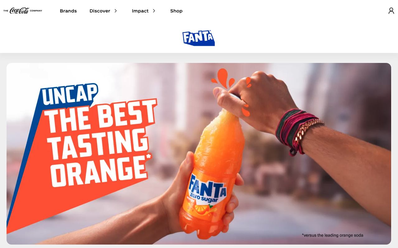
An example of a brand doing this well is the fruit-flavored soda Fanta, with its slanted sans serif font. While the logo is two colors (blue and white), each flavor uses bold colors and shapes alongside the mark to integrate seamlessly into it.
The Baskin Robbins logo is another example of how color can be used to highlight certain elements in a design. In this case, the color fuchsia is used to draw attention to the number “31” in the logo, representing the number of flavors Baskin Robbins offers. By doing so, the logo has a deeper meaning than just the initials “B” and “R.”
Typography as a Logo Design Element
Experimentation is one of the best parts of the logo design process. Applying this experimentation to typography can reveal how the unusual arrangements of letters add symbolism and depth to a logo.
FedEx is an example of how a font’s design treatment within a logo contains a hidden message. Notice the spacing between the “E” and “x.” The white space is shaped like an arrow, symbolizing the company’s speed and resilience in the industry. This arrow signals FedEx’s commitment to being a forward-moving, dynamic enterprise.
Typography does more than present words or letters to read. When paired with other elements in a brand’s identity, it shows the personality of a business.
Using typography in graphic design to create better logos
Your logo typography visually signals to consumers the essence of your business and what they can expect. Your company’s logo gives people something to recognize as part of your brand.
Not all fonts tell the same story, but they do a lot to make a statement.
The fonts you choose for your logo design are crucial to creating a memorable brand identity for your business. Whether you opt for a classic font like Times New Roman or a unique, custom-made typeface, it’s important not to underestimate its impact on your overall design.
