


Graphic design should be at the forefront of your marketing funnel assets
Jun 07, 2023
Conversion rates for funnels can vary for several reasons. But when its creative components visually align with buyers’ expectations, you can build trust and increase the chances of converting them as they move through it.
When design is an afterthought, it affects how the pieces of your funnel resonate with customers. Creating well-designed, on-brand assets within it enables you to give current and potential customers a consistent experience.
Here’s how to use design to ensure your funnel assets make the buyers’ journey smoother.
Empathize with the people in your funnel
Marketing funnels can be as simple as a landing page with an accompanying thank you page or as complex as a multi-stage, triggered email sequence that includes lead magnets and retargeted ads.
As you test, optimize, and refine the assets for your funnel, the insights gathered from your customers will be vital to understanding what emotional and psychological factors lead them to take action—or not—within your funnel.
Good design empathizes with the person on the other side of the screen. Businesses can use graphic design to show prospects their values match theirs, leading to ongoing sales, recommendations, positive associations, and affinity for the brand.
What should good funnel assets look like?
Like most businesses, the main goal is to attain high-quality leads and turn them into customers. As people become increasingly inundated with marketing content, they don’t have patience for companies that don’t know them.
Good funnels offer value throughout the journey by putting the customer front and center. They also use graphic design to organize information efficiently and creatively so people can experience what the brand provides throughout their marketing and sales ecosystem.
Designing your content
Content is king, but the design is its crown. A 2021 Demand Gen report found that 79% of buyers stated that a business’s site content impacted whether they made a purchase.
Graphic design organizes this content to move people down the page toward the call-to-action (CTA) and will:
– Be easy to navigate and only contains the messaging and design elements needed to guide people down the page.
– Use a clean design with a distinct visual hierarchy and clear delineation between elements.
– Maintain consistency between colors, typography, and other brand components.
– Include an easy-to-find call-to-action that tells people exactly what to do as the next step.
– Be optimized for mobile devices since 58% of traffic comes from people using them.
– Compress images so they don’t weigh down the page and decrease load time.
When used together, these little details create a user-friendly page that helps increase conversions on landing pages, emails, and websites.
Highlighting social proof
Testimonials and other social proof are essential for building trust, especially for high-value products and services. But sometimes, businesses may not put them on the page with design in mind.
Project management site Notion has a powerful tool that helps teams keep all their work in one place.
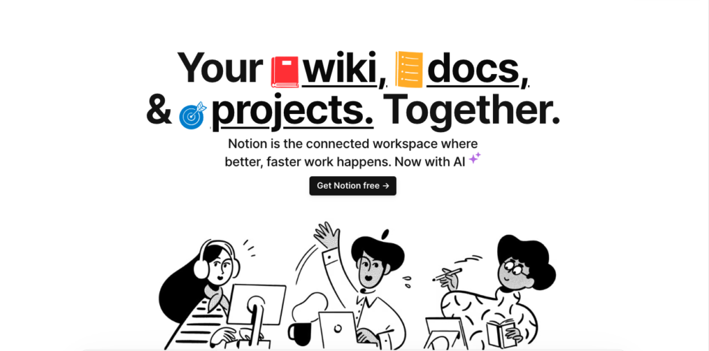
However, because their brand has a minimalist design, their homepage suffers from their social proof being hidden. If you’re scrolling quickly down the page, you could easily miss the testimonials sprinkled throughout.
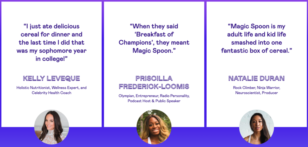
As another example, the breakfast cereal brand Magic Spoon uses color to separate their social proof.

People can easily see what others say about the company as they move through the page. The unique fonts and animated lines draw attention to each testimonial, so they can’t be ignored.
Optimizing your calls-to-action
CTAs lead to higher conversions when they’re clear and direct, taking the anxiety out of moving on to the next step. Here are a few best practices for your CTAs:
– They shouldn’t be surrounded by any distracting text or graphics that compete with it.
– Your CTAs need to include text around it that alleviates any hesitation, such as guarantees or benefit statements.
– If multiple calls-to-action are on the page, each must relate to the other and the business goal you’re measuring.
And as for where to put the CTA?
You’ll have to test out different areas on the page. CTA buttons are among the most tested elements on landing pages and websites. Sometimes, putting it below the fold can lead to higher conversions than using it above.
Design and funnels unite
Your ads, landing pages, social posts, videos, and other funnel assets take customers through your products and services. Each one of these assets needs to incorporate good design principles and user experience to make a positive impression on buyers.
People want to feel like your business’s experience is custom-made and designed just for them. By keeping design at the forefront, you can create and optimize your funnel’s assets to keep customers happy and increase conversions.
