Get noticed: Design matters in your email marketing
Aug 03, 2023
There’s no debate about how much we rely on email to communicate and market to customers. And the number we send is only rising. In 2023, people sent 347.3 billion personal and business emails worldwide, a 4.3% increase over 2022.
Email is still among the top tools for building brand awareness and generating business revenue. And to better understand the importance of design in reaching your goals, we’ve compiled a list of best practices to bring the best out in your campaigns.
Using email design as a success metric
Surprisingly, 39% of companies don’t test their segmented emails, making it difficult to know precisely which elements recipients respond to. They’re missing out on potentially gaining an impressive 760% ROI from separating their audience list.
Segmentation is essential in an age where buyers are less likely to interact with companies in-person, especially with B2B sales. Instead, they prefer learning about companies on their own time.
But even as people avoid hopping on the phone to speak to a sales rep, they are still reading emails.
And they’re influenced by the design elements in those emails, which gets people to open, click, and reopen. These are also buyers who tend to purchase more than others that don’t take a second and third look at this marketing messaging.
So how can you tell which part of your email design makes the biggest impact? A/B testing.
Testing your emails can expose the effectiveness of their design.
A/B testing can identify how small changes in an email header, button color, or graphic can produce significant click-through rate shifts. And the companies that A/B test ultimately see results upwards of 37% higher than those that don’t.
What makes a well-designed email?
Subject lines get people to open emails. However, their design provides the visual cues needed to move someone through the content so they click.
But design is subjective.
One person can look at one email and think it looks gorgeous, while another might believe it’s too busy. But the ones that get people to click adhere to these design standards.
Embrace whitespace
Whitespace, or “negative space,” is often considered too simplistic and boring. However, when used correctly, it helps balance all the elements within the email and directs people toward what they should do next.
Giving your email’s text and graphics room to breathe lets people quickly see important information that gets them to click through to a product page, lead gen form, or other sales page.
Delight with animation
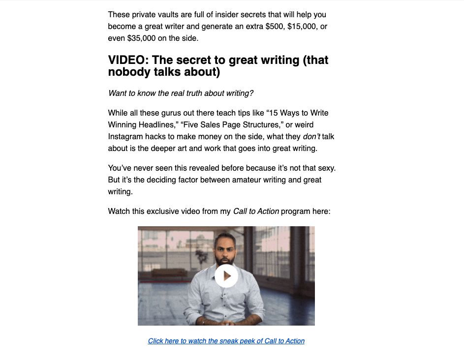
Hands down, moving images get people’s attention. Even using the word “video” in your subject line improves open rates by 6%. But it’s tricky to use them because most email clients are picky about embedding videos within emails.
You do have options, though, to add animate elements to emails, such as:
– Adding a text link to a YouTube video into your body copy. This inserts a playable thumbnail or attachment to the bottom of the email.
– Create an animated GIF to briefly give people a preview of the video. A couple of tools to help you do this are Adobe Express and Kapwing, which can quickly turn your videos into GIFs.
– Including animation in parts of your email can draw attention to specific messaging and offers, which can be highly effective for time-sensitive emails.
Style your buttons
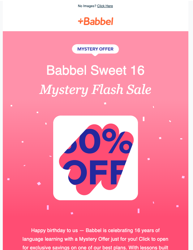
Size matters with your buttons. Increasing their size creates a visual contrast between them and the rest of your email content. In addition, using colors that stand out against the email background and text makes them noticeable to readers.
Representative imagery
When segmenting your audience, the email images can draw them into your brand story or repel them. The products and photography used in your email marketing must match the expectations for each segment.
Your audiences form these expectations based on experiences with your brand, its products, and the promise made in your email subject line that made them click in the first place.
Readable, on-brand typography
The fonts used in your email can create a mood, leaving your reader feeling like they’re part of the story too. And as Cyrus Highsmith, a typeface designer and author of the book Inside Paragraphs, said, “Typography is one ingredient in a pretty complicated presentation.”
And it can do a lot of heavy lifting in your emails.
After a person clicks on your marketing email, the next thing they’re looking at is the header section of it. Sometimes this can be plain text, but more often than not, this area has some sort of design treatment.
If this space is styled in your email, the typography must be readable and distinctive. Stick to your brand fonts and keep any ornate fonts to a minimum, and you should be all set.
Smart use of emojis
There’s debate about whether emojis are tastefully entertaining or annoyingly tacky. But when used in subject lines, which are also part of your email design, research shows that inserting an emoji can lead to higher open rates.
If you decide to use them, test out how they look in multiple email clients and only choose emoji that don’t scream “spam.” (e.g., avoid using “🙌😱🤑 20% off 💥 new 👠👞 now‼️🔥” as your subject line)
And when in doubt, think about your audience. Using one emoji is better than five.
Keeping your design elements on-brand
Preserving your email’s brand identity enables readers to build and maintain connections with your business.
Again, since they aren’t created equally, you want to experiment with how various elements like logos, brand colors, and other graphics look across different email service providers.
Doing this before sending your marketing emails can help you catch anything that looks off-brand (like drastic color shifts) before it reaches your list.
Email design is good business
Email marketing is one of the most powerful tools you can use to communicate with customers. The design of your email campaigns has several criteria to meet if they’re to be successful. They must be relevant, unique, and memorable to the people you speak to.
Ensuring that your campaigns are on-brand and designed with the recipient in mind enables you to produce campaigns that rely less on the quantity of messages sent than the quality.


