Bringing Your Design Aesthetic into Your Brand
Mar 04, 2022
Can your brand have too much personality? Not if it authentically reflects what the business represents. It’s why we encourage new business owners to look deep within and bring their aesthetic into the brand.
The question shouldn’t be, “What should my new logo look like?” It’s “What kind of personality does it have?”
Designing a brand for the first time
It’s easy to get caught up in the fun stuff, the details of what the new brand will look like. But before creating a logo or writing any taglines, it makes more sense to sit down with a brand designer to hammer out the essential details.
It’s a process known as “Discovery,” and it’s the time where you’ll get peppered with questions about your likes and dislikes, such as:
– What patterns or color combinations do you like the most?
– How do you want people to feel when they look at/think of your brand?
– Is there one word you would use to describe your brand?
This might be the first time you’ve ever thought about how developing your brand will impact the business. And as you think about this, you’ll want to consider how your aesthetic fits into it.
Inserting your personality into the brand
If you’re starting your business from the ground up, you’re making all of the creative decisions. As you do, don’t be afraid to bring parts of your personality and story into the brand. Showing the human side of the business resonates more strongly with audiences than taking the conservative approach.
Maybe there was a particular symbol you wanted to include in the logo with a special meaning or symbolizes part of your mission.
Or perhaps brighter colors represent a significant achievement or milestone, and it’s what you want people to experience when they engage with your business.
So what’s your style?
But what if you don’t know what your style is? Or you don’t know how to put it into words. You could always turn to the companies you already know for inspiration.
Here’s a non-exhaustive list of a few brands and categories to get those wheels turning.
Retro
Nostalgia and a sense of light-hearted fun encapsulate retro brands Steak n’ Shake and Vans.
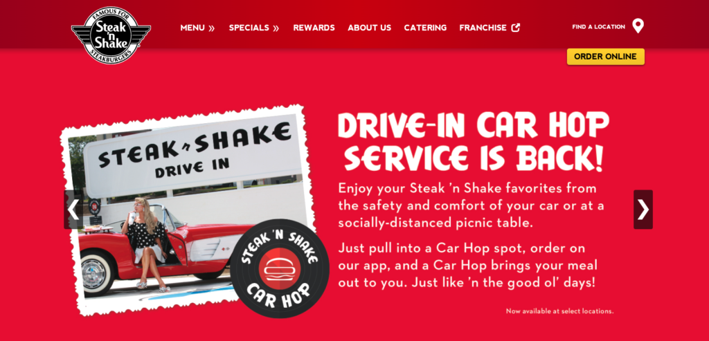
With brick-and-mortar restaurants all over the US, each Steak n’ Shake makes you feel as if you’re grabbing a milkshake, back when calories didn’t count. It’s old-school wholesomeness where the stars are simple graphics, geometric patterns, a simple color palette, and mouth-watering food.
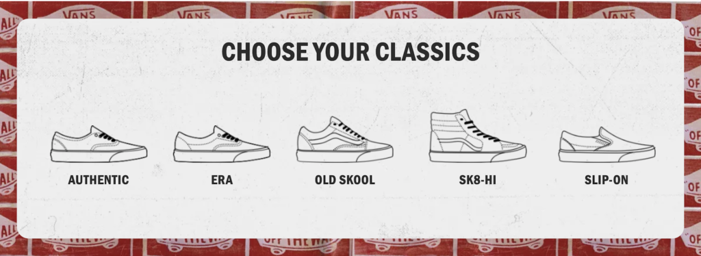
On the flipside, Vans exudes an aura of coolness with retro design treatments and weathered textures. The brand wants people to feel like their chilin’ with friends from their website to the shoes.
Minimalistic, clean, & informative
When people think of minimalist brand designs, Apple usually makes the Top 5 on the list. But other companies like Stripe, Revolut, and Basecamp also have impactful yet straightforward branding.
Stripe and Revolut use clean, minimalistic design elements in their brand to convey trust and reliability. Basecamp doesn’t focus so much on their product photography as their message. They use their digital real estate, clean design, and a whole lot of text to speak to their audience in a relatable way.
Energetic, lively, & young at heart
For being over 130 years old, Nintendo doesn’t look a day over 25. It’s still one of the most playful brands that created the games we grew up with and continue to enjoy. Nintendo has a footprint in our culture with its bright colors and iconic characters that aren’t going anywhere soon. Their story is one of embracing the joy and freedom your inner child brings.
Meanwhile, younger companies like Spotify use their brand to tap into the sounds that move music lovers’ souls. Spotify encourages people to jam out whenever, wherever, from their social presence to the player itself.
Classy, refined, and daring
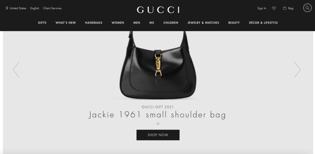
Luxury brands like Gucci and Omega bring new meaning to fully immersing oneself in the lifestyle. For Gucci, it’s all about going big with their brand. Unusual patterns and vivid photography bring this company’s advertising to life.
On the other hand, Omega is understated yet powerful in putting their watches and jewelry front and center. Their simple red, white, and silver color scheme and prestige products symbolize extravagance and sophistication.
Evolving your brand
As you – and the brand! – evolve, certain elements will change over time. It’s natural, normal, and needed for your company to keep up with its audience and marketplace trends.
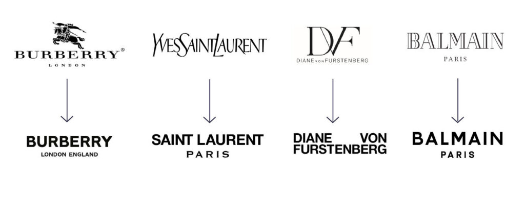
Burberry, Yves Saint Laurent, Diane Von Furstenberg, and Balmain underwent brand redesigns, including getting rid of their famous logos in exchange for simplicity. Modern font treatments replaced the iconic marks shown above. Whether this was a good idea has yet to be seen. But in your case, it may only make sense to make such a drastic change once you’ve created a longstanding, iconic brand.
Your brand is more than a color scheme
Your personal aesthetic show the personality of a business and what it represents. People respond and feel connected to companies that don’t limit themselves. And the ones they remember have prominent voices and distinct identities.
So if you’re worried about putting yourself out there, don’t be.
Your story, your aesthetic, is where a brand’s characteristics naturally take shape. And as it evolves, each part of the brand, combined with your story, will work together to build a unique presence people will relate to and hopefully fall in love with.


