


Meet the Atlanta Designers Who Created the Coronavirus ‘Spiky Blob’
Nov 05, 2020
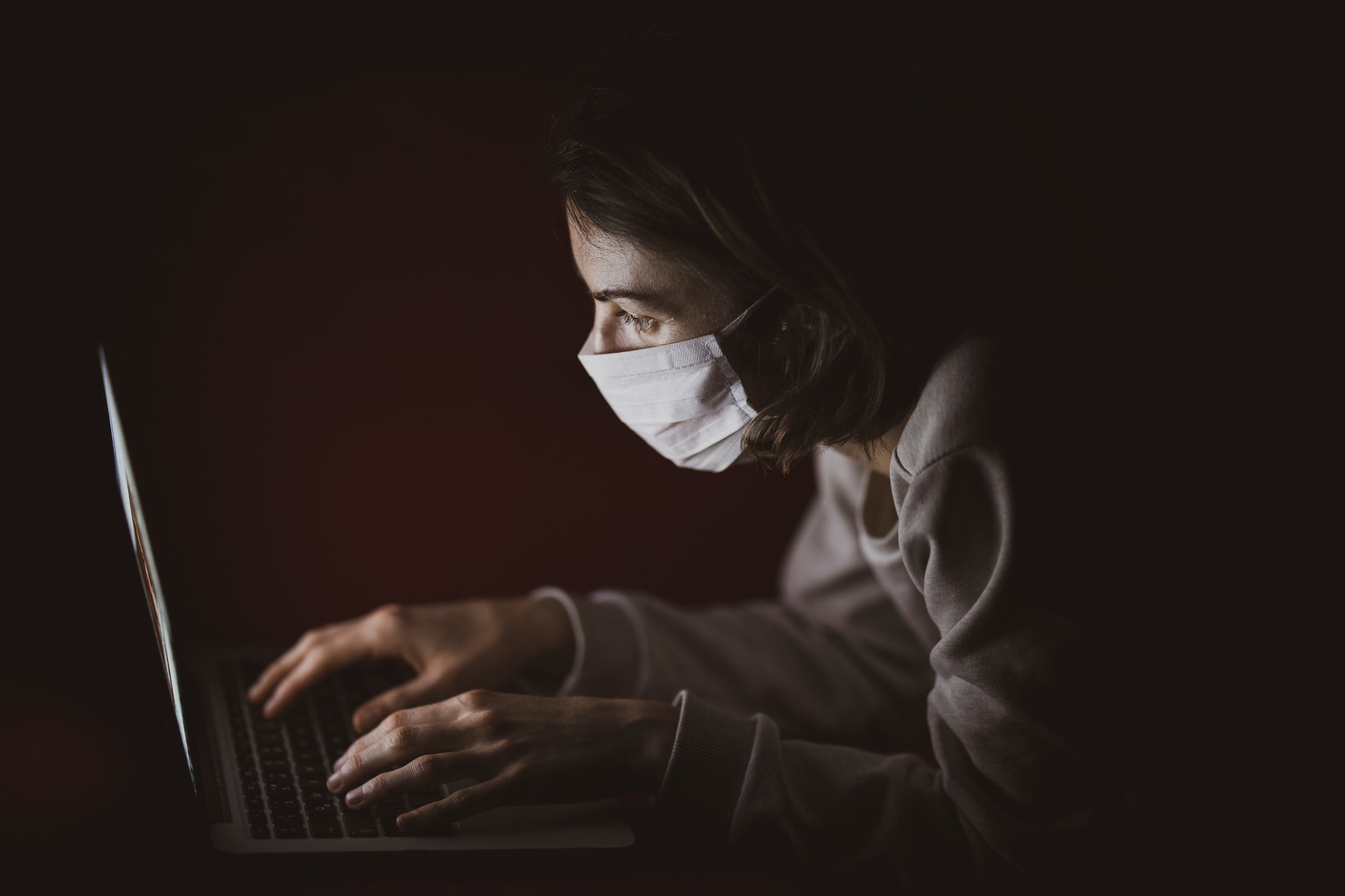
There are many images that help define the coronavirus pandemic, whether they’re tragic or hopeful. People in masks going about their daily lives, hospital scenes, delivery drivers dropping off food at someone’s door, frontline healthcare workers on a shift change, the Zoom call with its many boxes.
But one image defines the coronavirus more than anything, because it actually is the coronavirus. It’s what’s known as the “spiky blob” — a visualization of the coronavirus that causes COVID-19.
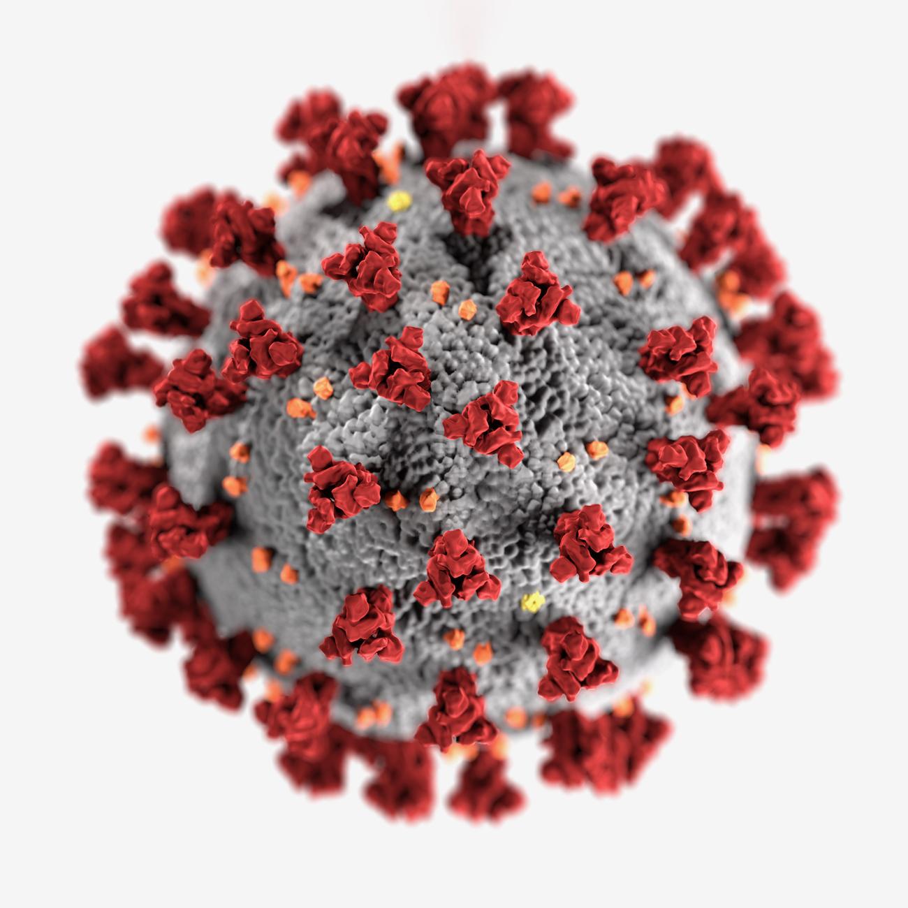
People don’t often think about medical illustrations like this one, or the process that goes into creating them. But the spiky blob has had a huge impact since being created in January. And we’re proud to say it was designed by two people right here in our hometown of Atlanta.
Alissa Eckert and Dan Higgins are medical illustrators for the Atlanta-based Centers for Disease Control & Prevention. We found their story thanks to Alice Rawsthorn, a design critic and co-founder of the Instagram Live series Design Emergency, which explores design’s role in the coronavirus pandemic and other crises.

Rawsthorn interviewed Eckert about the world’s most famous medical illustration for Wallpaper, a London-based publication focusing on design and architecture, fashion, travel, art and lifestyle.
It was interesting the way that Eckert described what she and Dan were tasked with when they were assigned the project in January. She said they thought of creating an identity for the virus as “a mugshot, something that represents what this enemy is.”
Meanwhile, other CDC designers were working on more coronavirus materials, according to the New York Times. So, just like any other design project, the image would have to go along with the branding.
Eckert and Higgins interviewed CDC scientists to know what needed to be included, especially which proteins should be a part of the image. Then they downloaded images from a CDC photo bank and then used four different kinds of imaging software to tweak and tweak and tweak.
The image needed to be up close, dramatic and bold in order to catch the public’s attention.
We’ve been tasked with thousands of design projects over the years with so many different needs, so this rang familiar. But little did Eckert and Higgins know that they’d be designing the symbol of a virus that would go on to kill hundreds of thousands of Americans.
Eckert told Alice that they wanted a velvety texture on the red and orange proteins in the image, so it looked like you could touch it and feel it. Red and orange also happened to be good colors to highlight to help drive home the public health warning aspect of the design.
Eckert and Higgins focused on the big red S proteins, which make the coronavirus so contagious when attached to human cells. That’s also what gives it a crown structure, which reveals the origin of the virus type’s name.
“Corona” comes from the word “crown” in Latin, and those spikes bind to cells to allow the virus to enter, according to Dr. Deb Gumucio, co-founder and director of the University of Michigan’s BioArtography Project.
Eckert and Higgins worked on the project for just a week, it took just three days for the CDC to clear it, and it was released to the world on the final day of January.
Gumucio gave the image high marks for how the designers incorporated the red and orange proteins.
“That’s why washing your hands with soap is so important—it denatures those proteins on the surface,” she said. “If the virus does not have those proteins, it cannot infect a cell.”
Gumucio believes the image — which she likened to “some sort of menacing alien machine” — could serve as a constant public reminder that people have the power to destroy those proteins if they wash their hands thoroughly enough.
Eckert told Rawsthorn that the spiky blob gives a face to the unknown.
“That’s how I think of it, because it gave people something substantial that they could hold on to and comprehend,” she said. “It was so important to have something that people could see and recognize.”
We love how this project has shone a light on the little-known but vitally important work of medical illustrators. And, as always, we love how much this showcases the power of design.
