
Breaking Down the Anatomy of a Great Landing Page
Oct 05, 2020
As part of your marketing strategy, you’ve decided to pump up your lead generation campaign. To do this, you know you’ll need to create a great landing page for your website. Or depending on your strategy, it may also make sense to create a standalone landing page.
But it isn’t enough to put up a page and call it a day.
The sole purpose of a landing page is to convert visitors. These conversions are defined as an equal exchange of their information for a benefit your business provides to them. There must be a rationale behind what you’re doing and how it relates to prospective customers.
So let’s walk through some of the essentials needed to keep visitors on your site and get them to take action.
Understand Who’s Coming to Your Landing Page
Before creating any landing page for your business, it’s helpful to know who your audience is. As much as you might want to have everyone as a customer, this type of thinking is detrimental to your marketing efforts.
You probably aren’t serving everyone, right?
Landing pages are meant to convert, which means they need to be laser-focused and speak directly to a specific group. To get a sense of who this is, you’ll need to create a persona, which is a fictional representation of the key segment you want to target.
As you build the persona, you’ll base it on several attributes gathered by researching your market.
Some of the most common persona characteristics include:
- Gender
- Age
- Income
- Likes/Dislikes
- Goal/Challenges
After defining these traits, you can begin creating a tailored strategy and messaging to fit the persona(s).

Using Compelling Offers are a Must
Since the goal is to convert visitors on your business’s landing page, there needs to be a reason for them to hand over their information or sign up for a product. You’ll fulfill this need by providing them with an irresistible offer.
There are several types of content you can use to provide value and improve the chances of getting a new lead. Common lead magnets companies use are eBooks, courses, videos, demos, and trials.
But no matter the type of content produced you decide to create, it needs to solve a problem or help the visitor move closer to a goal they want to achieve.
Another thing to keep in mind is the number of offers on the landing page itself. Stick to only one. You want to turn landing page visitors as quickly as possible. Don’t confuse people with conflicting messaging and offers on your landing page. When in doubt, keep it simple.
Tell People Exactly What They Need to Do
As part of building a good landing page, it pays to be direct. The most important information needs to go above the fold, so it’s one of the first things people see once they hit the page. The placement of these elements shortens the decision-making time, leading to quicker conversions. This is why you want clear messaging and a direct call-to-action (CTA) in this area.
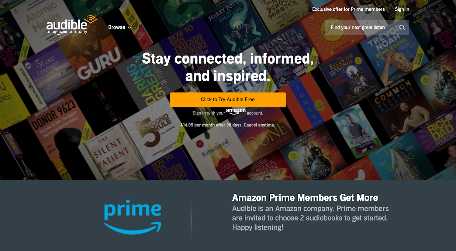
Audible does this well by putting their actionable content and keeping it simple. The audiobook service encourages people to sign up for a free, hassle-free trial that they can cancel at any time.
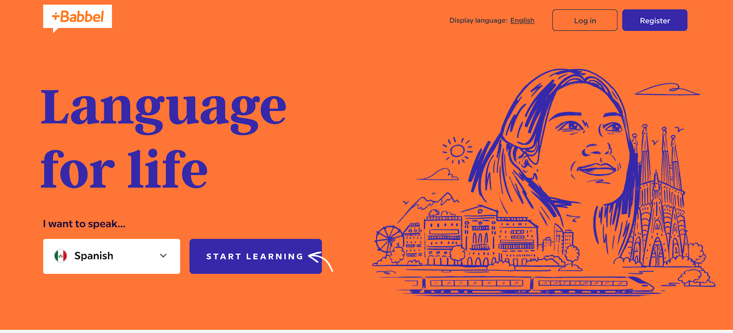
Language learning tool, Babbel’s landing page allows you to choose a target language and immediately start learning. The page doesn’t overload users with information, but instead, it only requires a couple of steps to jump right into the app.
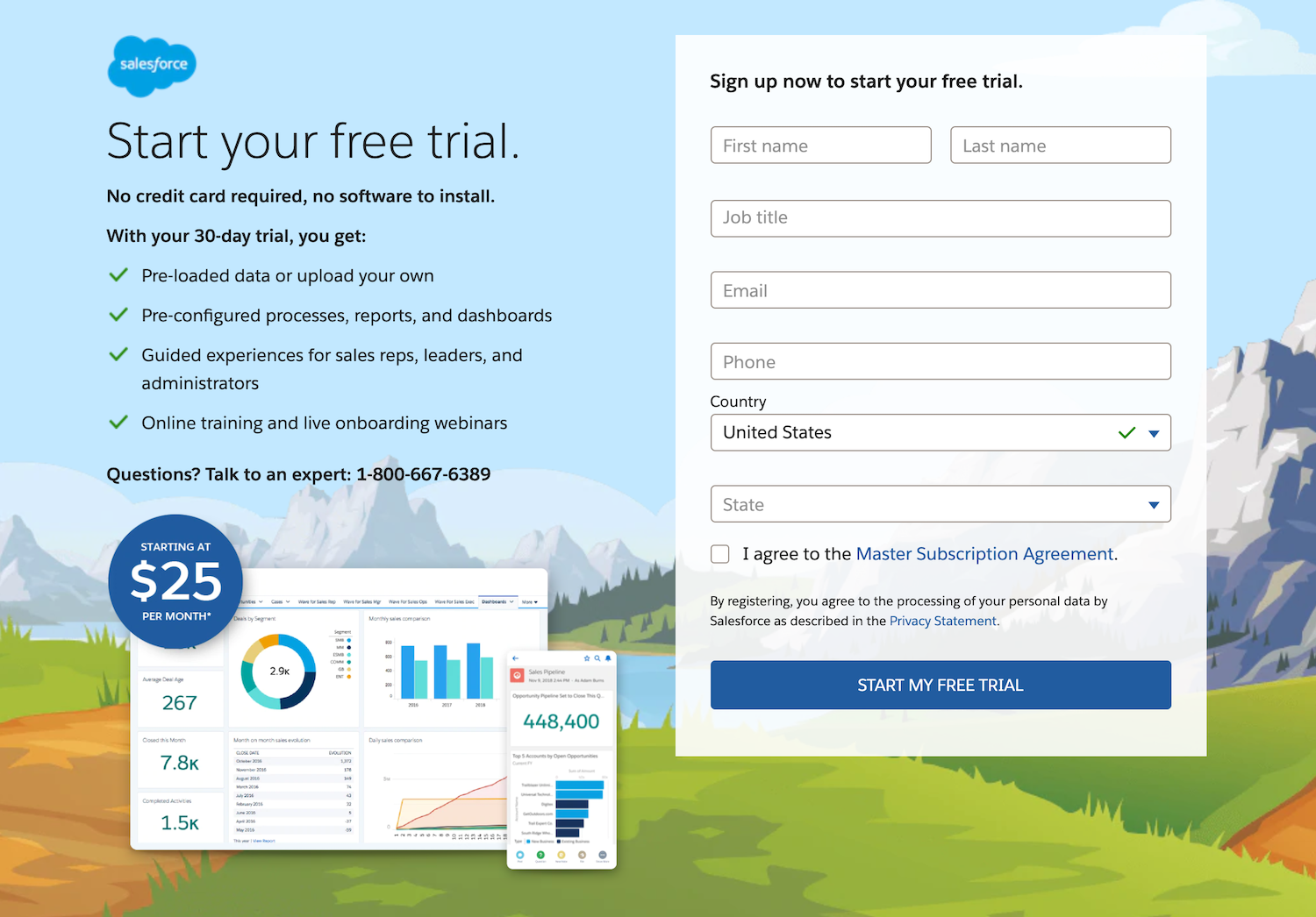
Salesforce’s landing page includes a more traditional form for visitors to fill out. However, its main focus is to promote the benefits users can expect from the free 30-day trial.
Each of these landing pages includes strong CTAs, telling users exactly what they need to do to gain the benefit. While it might look easy, coming up with a straightforward and concise CTA is a fine art. It also requires an understanding of the psychology behind which words will trigger an action.
For instance, ‘Get Started’ and ‘Start My Free Trial’ are some of the most common CTA phrases used. Why? These are words get results and indicate to landing page visitors that there is a mutually beneficial interaction once they click that button.
They are receiving something, which makes them more inclined to act. It’s a win-win situation.
Create Attention-Grabbing Headlines and Copy
The headline and subsequent copy are important determiners in whether or not someone will stay on the page, meaning that you need to put a lot of effort into getting it right. If you nail both of these, the path to conversion is shorter because the page is written in your audience’s language.
Here are a few examples of companies that got it right.
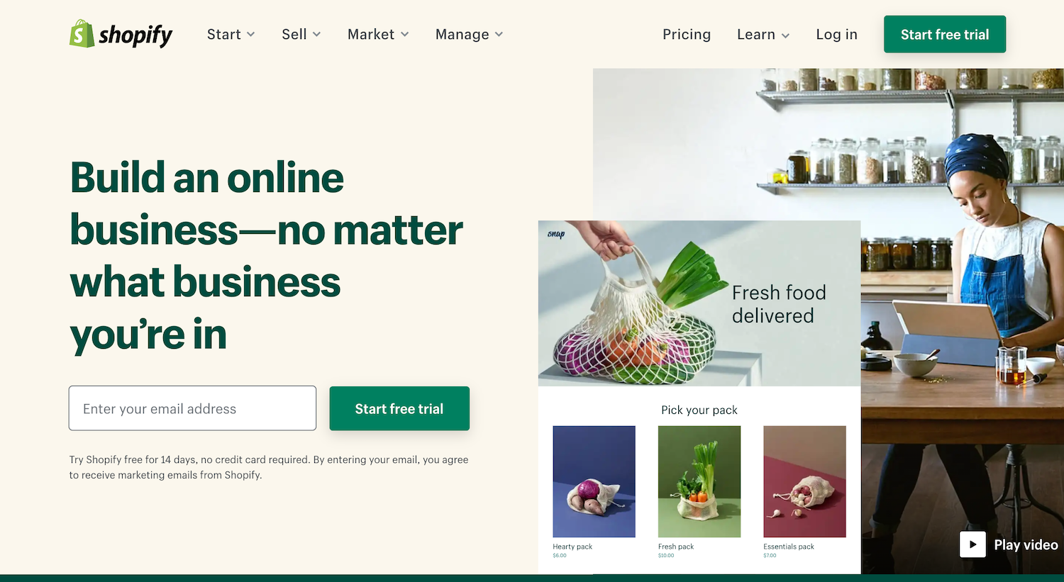
Shopify’s main headline directly targets online business owners, no matter the industry. As you move further down the page, each subhead highlights features business owners need to create their ecommerce site.
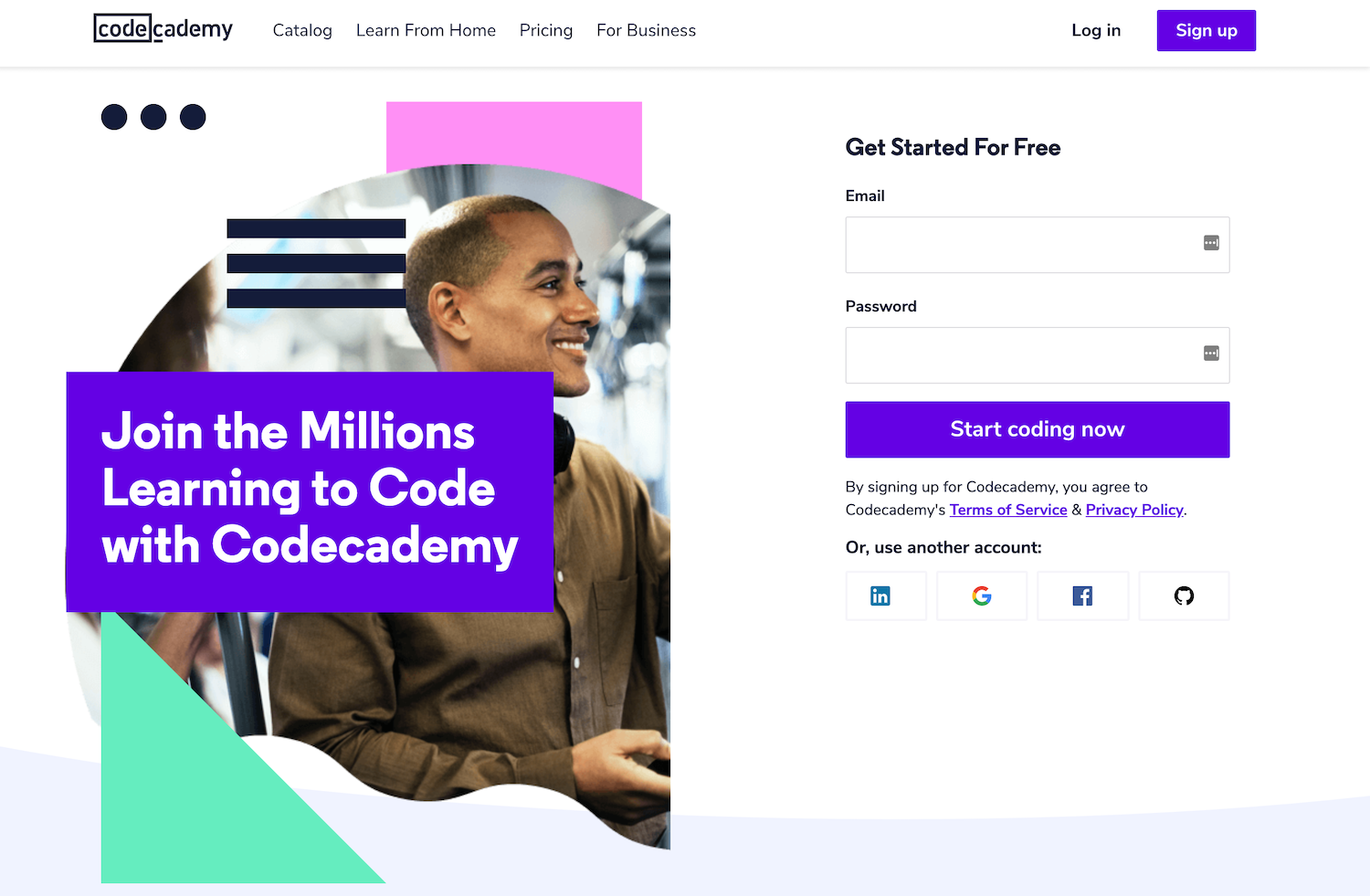
Codeacademy uses a friendly headline on its landing page to show inclusivity and prompt users to join an ever-growing group of code enthusiasts. They understand their target audience may feel overwhelmed and unsure about which lessons to take. To address this, they’ve broken the page down into personable, easy-to-digest sections to lead users down the correct path.
Once you’ve got people’s attention with the headline, it’s important to keep them on the page with the copy. Each word needs to be more interesting than the last and guide users through the page.
Since you only have a few moments to get the conversion, the copy needs to be direct, purposeful, and conversational. Words like ‘your’ and ‘yours’ establish a casual dialogue between you and users, even while the interaction occurs online.
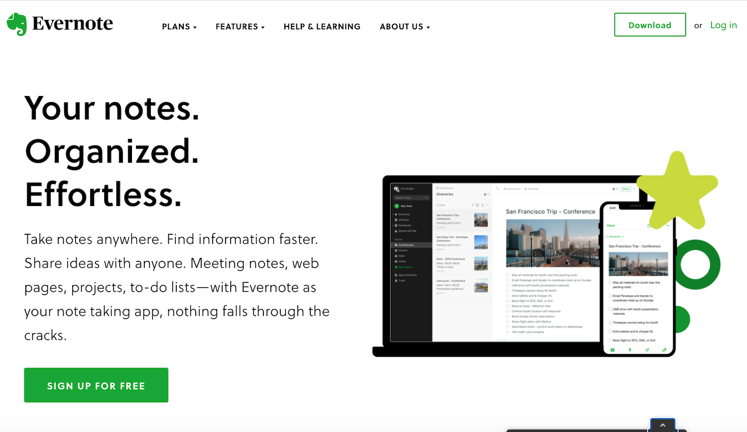
The conversation starts well on Evernote’s landing page. They use informal language to show the benefits of using their app and how it simplifies the lives of the user.
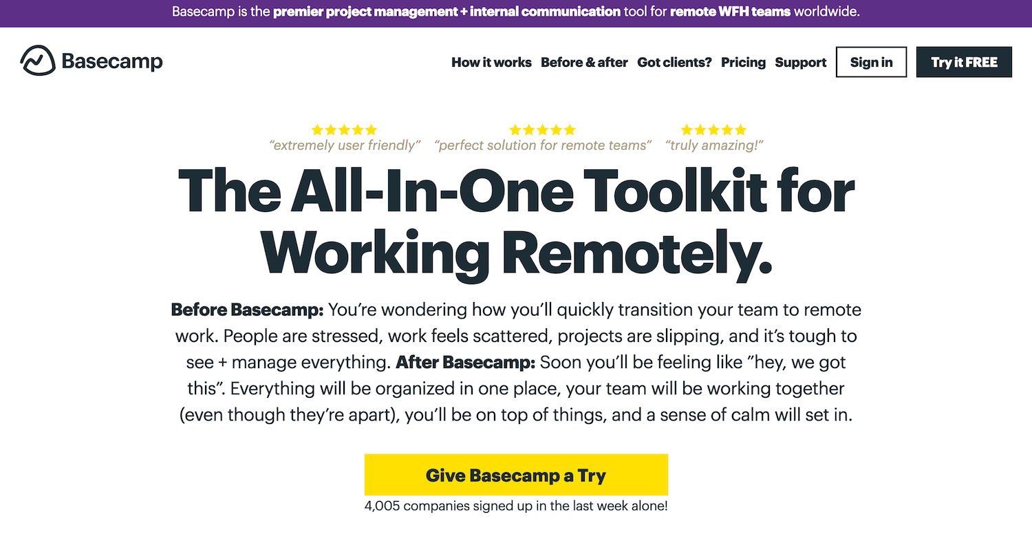
On the other hand, Basecamp takes the conversation a bit further. So much, that you feel like you’re having a chat in person. This landing page highlights the situations people face before and after signing up for this project management system.
By putting a lot of effort into the copy and approaching it from a perspective of solving a problem, you’ll get more eyes and help users view your business as one with personality.
Play With Visuals on the Landing Page
We’re not going to let you go without talking about how imagery places a big role in a great landing page design. Your audience wants to envision themselves using a product or service and feel excited about the brand.
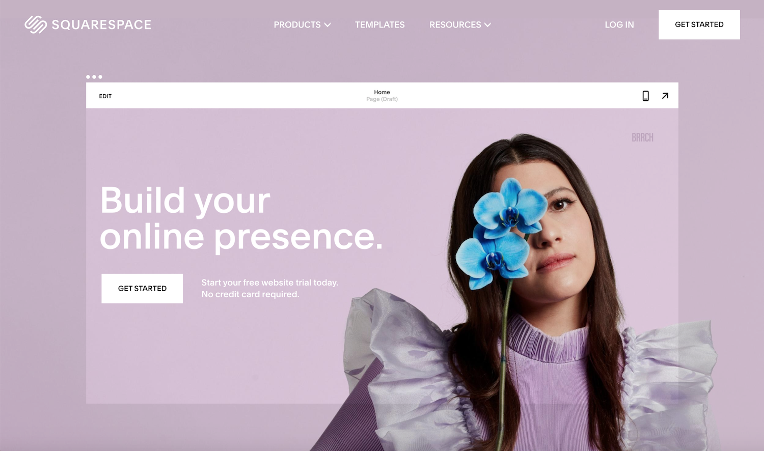
Squarespace is a tool used to create websites for those who are not coders. What better way for people visiting the site to see this than by making the website user front and center with a clean layout and a monochromatic color scheme.
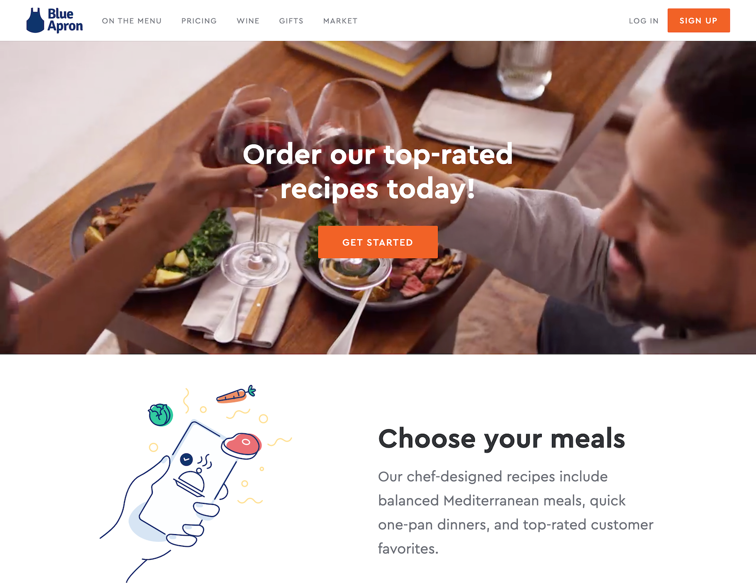
Illustrations not only guide the eye but explain exactly how Blue Apron works. Their attention to detail leaves little question about what people can expect when ordering from the company.
Think of unique ways to draw people towards your offerings visually. If you need some help doing this, we might know a design team that can help.
Highlight Your Testimonials
One of the primary elements you’ll want to include on your landing page is social proof. Testimonials are powerful endorsements to share other customers’ experiences and what users can expect from your business.
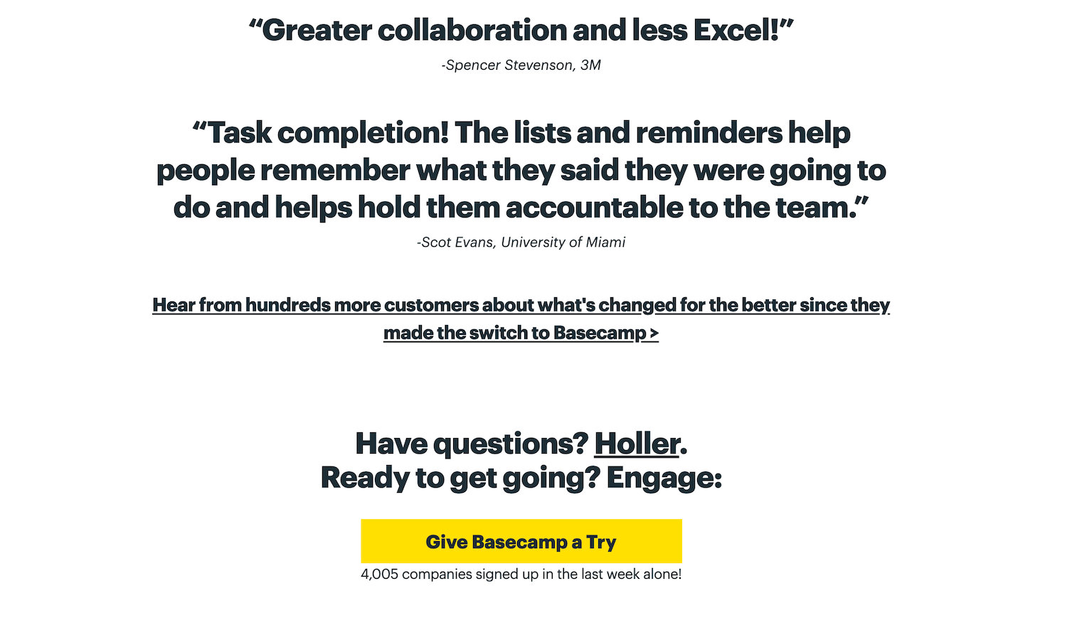
Even though their testimonials are text only, Basecamp uses a larger font to separate them from the rest of the content. The list is punctuated by a bright yellow CTA button beneath them, encouraging people to give it a whirl.
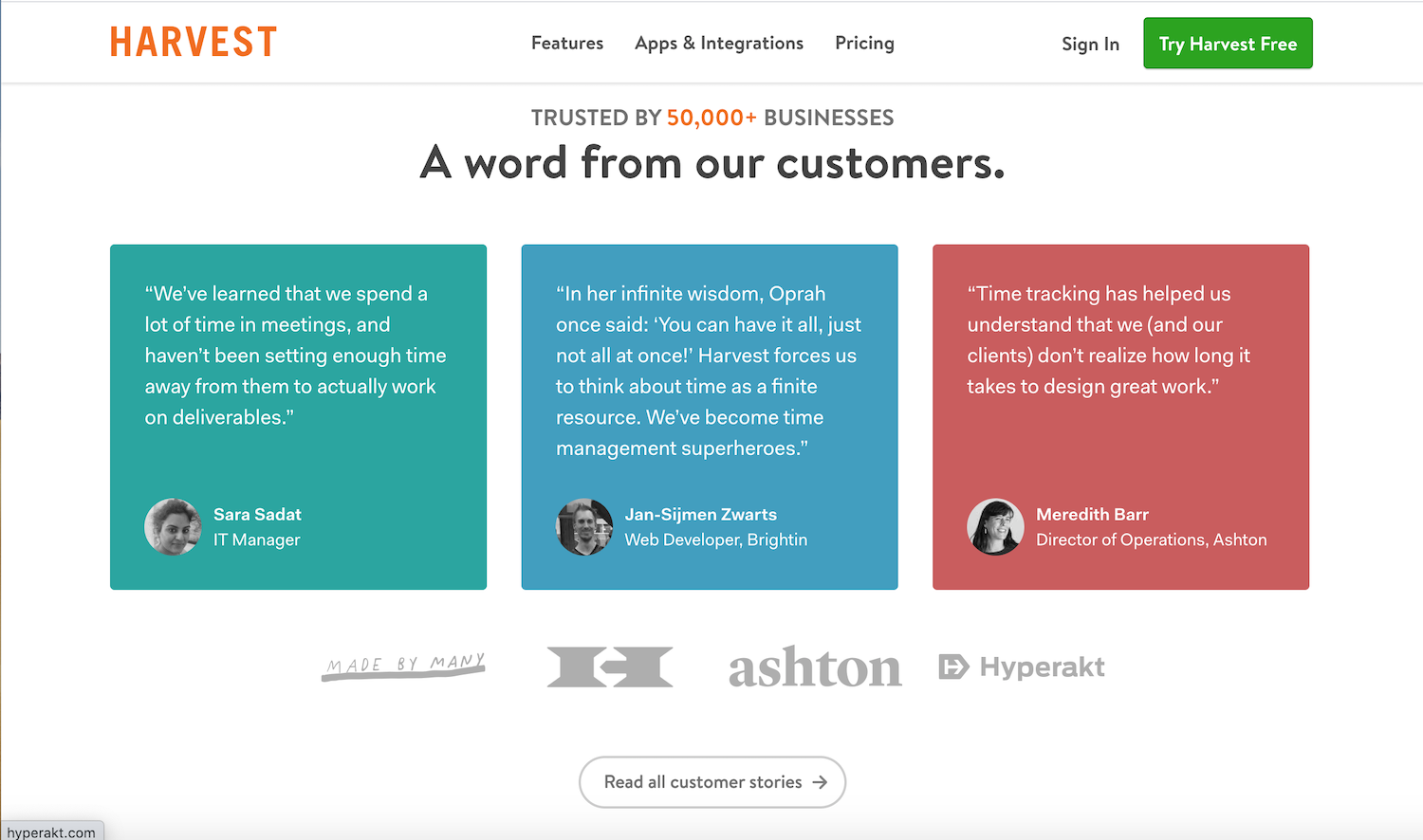
Harvest uses color and imagery to highlight happy customer’s feedback. Neat colored squares make each testimonial stand out. The logos beneath bring focus to some of the larger brands they’ve worked with.
If you have testimonials for your products, don’t be afraid to use them. Share the stories of happy customers and add yet another reason for people to convert on the site.
Conclusion
Landing pages are an effective tool to generate leads and convert visitors. Discovering who those visitors are and creating a page to solve their specific problem is how you set yourself apart as a business that understands its customers.
Give them reasons to trust you with their information, and you’re well on the path to closing more conversions and sales.


