How Atlanta’s Bizarre Intersection Designs Became Art
Sep 08, 2020
If you read our blog regularly, you know we love to highlight the moments when design and our beloved city of Atlanta intersect. Well, today’s topic couldn’t fit that description any better.
You’re probably familiar with the oddities of how Atlanta’s intersections are designed. Some might call them city planning missteps. We call them unique city quirks.
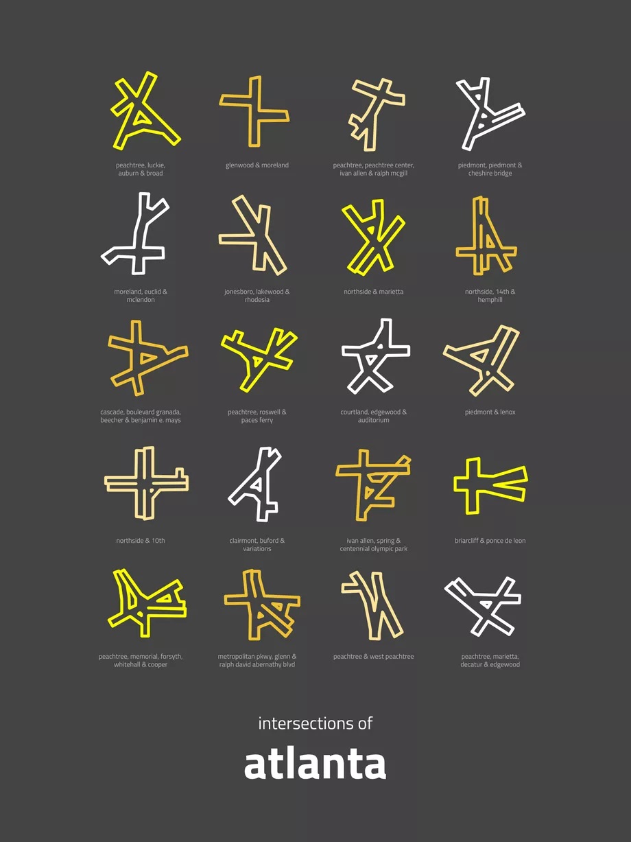
Well, now those quirks are considered art! Located in Hawaii, map designer, Peter Gorman created a work called “Intersections of Atlanta” to show 20 of the city’s most creative interchanges rendered on a dark gray backdrop.

We have a soft spot in our hearts for the design showing Ivan Allen, Spring, and Centennial Olympic Park — that’s a block from where our offices are located! Several others stick out for us, including the design featuring Piedmont and Cheshire Bridge, where founder, Kyle Strahl first began dreaming of what would become KEYLAY.
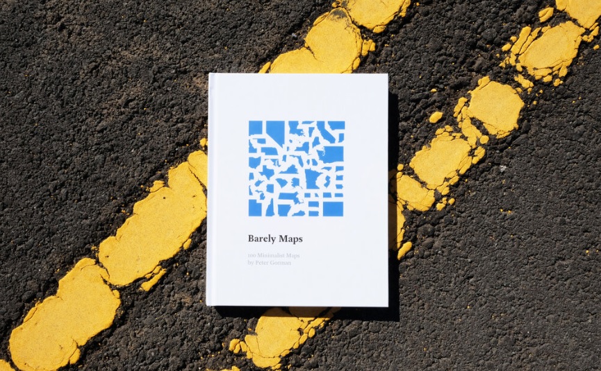
Gorman’s work is part of a series called Barely Maps. He was inspired to create the project after making an 11,000-mile solo bicycle trip around the U.S. and Canada. Gorman created 100 minimalist maps that focus on 31 cities, which are compiled in a hardcover Barely Maps book. And there was no way he was leaving out the ATL.

“Since I started, I’ve been getting recommendations for new cities to adapt the design to, so Atlanta has been on my list for a while,” he told Curbed Atlanta. “It was fun to explore; I really like the names of streets in Atlanta, especially all of the Peachtrees.”
We can attest to the confusion that greets out-of-towners trying to navigate the city with so many roads named “Peachtree.” There are not just 5 or 10 Peachtrees. Oh no, we’ve got over 70 of them! And we should know because our offices are on the one with ‘West’ in the name..
You might also remember that the City of Atlanta worked with KEYLAY to help people travel those streets without a heavy hit to their wallets. We redesigned the parking lot signs that keep people from getting booted or towed. That design is now replicated on thousands of signs across the city!
After Gorman shared his Atlanta design online, many commenters fittingly spotted “A”-shaped intersections.
“One of my favorite parts of sharing these designs is hearing what people see in the shapes,” he said. “One Reddit commenter was even able to spell out ‘ATLANTA’ using just the intersection shapes.”
We’re not sure what the city planners thought when all these intersections were created, but we love that the result ended up being something that stood out enough to make it into Gorman’s book.
We know from experience that often the most obvious design is not always the most impactful or practical one. Every day, we make so many decisions like that in our work for our clients, and we wouldn’t have it any other way!
And if you’re feeling left out of or lacking a connection with Gorman’s project, don’t fret. He has an Etsy shop where you can order prints of his maps, and it might just have your city in the mix! Both he and his loyal following of fans who love minimalist design inspires us to look for—and at—new ways to envision our city streets.


