


What are the Traits of a Good Brand Identity?
Aug 10, 2021
What words spring to mind when talking about brand identity? Logo design? Your company’s name? These are only a few of the elements making up the brand and only part of the story.
Your brand’s identity encompasses the entire business: its mission, visual elements, and all other identifiers.
So let’s see how to spot a good one.

Memorable Brand Identities Have Personality
The relationship between brands and customers is similar to dating. Most people want to be with someone dependable, stable, and of course, interesting.
And it’s the same way when making a buying decision.
Businesses with an effective brand identity understand the nuance of building a connection with customers by showing off their personalities.
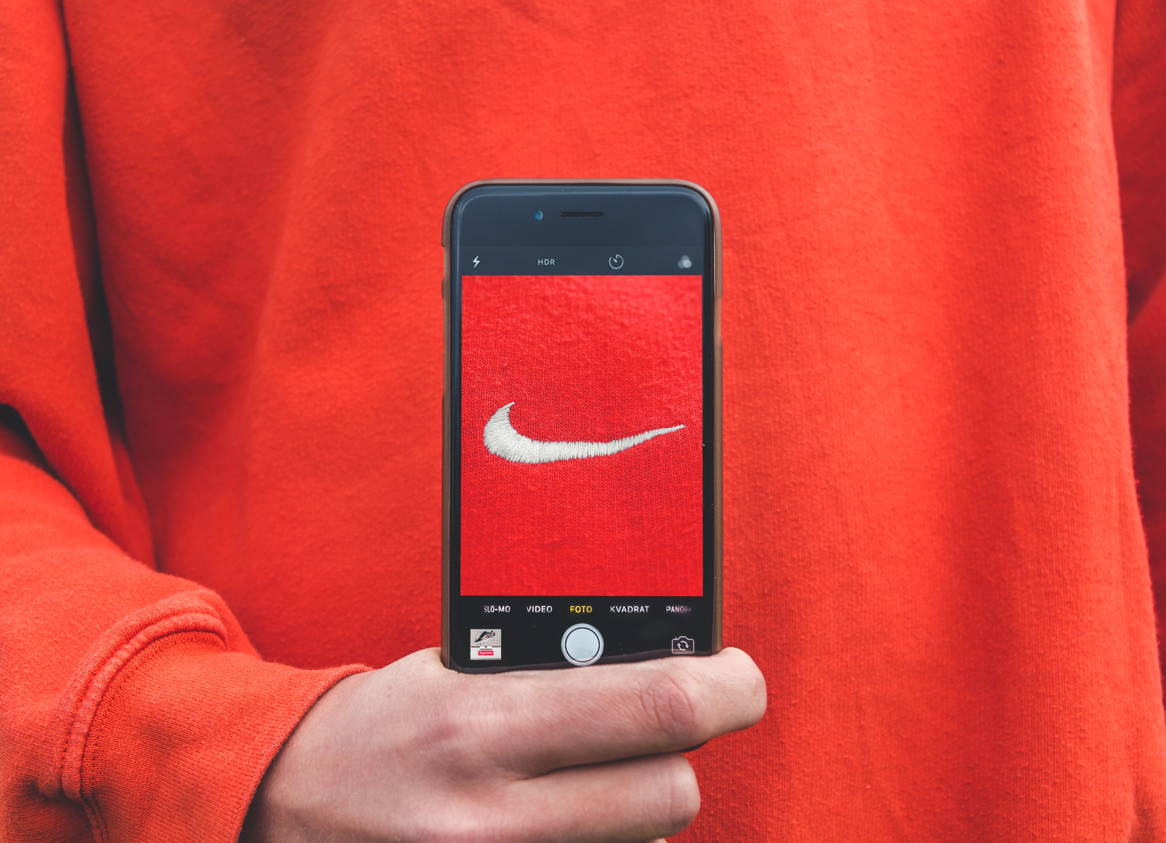
Nike
There’s a reason why we remember the Nike “swoosh” and associate it, and the brand, with pushing past physical limits to achieve personal athletic goals. Nike’s brand personality is one, which speaks to human nature. For almost 60 years, the company encouraged people not to limit themselves and “Just Do It.”
They’ve successfully created a brand that continues to resonate in the minds of athletes, both amateur and professional, around the world.
NBC
The NBC peacock logo has changed many times over the network’s 94-year history. It’s one of the most recognizable marks in US television, but there’s another part of their identity that hits a musical note.
The NBC chime is an example of how a brand’s identity is not only wrapped up in its visual elements. Sound also plays a role in rooting itself in our psyche.
T-Mobile
Pink is a color generally associated with romance, femininity, and of course, the Pink Panther. For T-Mobile, their trademarked magenta is distinctive in the world of telecommunications.
But the color’s origin began in Germany. Deutsche Telekom, the parent company of T-Mobile, was at one time owned by the German government.
After the reunification in the early 90s, Deutsche Telekom became privatized. A new brand was launched featuring the trademark “T,” which initially represented their landline service, and a striking magenta used as their main color.
Within two years of the new launch, nine out of ten people in Germany associated these two elements with the brand. Since then, the telecommunication company’s signature color has been at the center of many legal disputes, citing other businesses using it in their marketing.
Brand Identities are Clear & Direct
Inconsistency. It’s the death knell for brands who take a scattered approach to their identity.
The companies who get it right always maintain consistency with their corporate identity and branding. People understand Coke will always have the same red cans, and Sony will use the same slab serif font.
The tone of their messaging stays the same, and their audience won’t suddenly be thrown for a loop one day due to a renegade designer or writer.
Existing Brands Aren’t Afraid to Look at Themselves
Even established brands have to take a step back every once in a while to see whether they’re still relevant. Brand audits expose all of the strengths and weaknesses of the brand.
They go deep to uncover what is and isn’t working for the brand. Businesses can better serve themselves, but more importantly, their customers by using brand audits as a starting point to improve.
Part of the process includes reviewing:
- – The company’s marketing and sales strategies & tactics
- – Internal organizational structures
- – Strength of products or services
- – Customer perceptions about the brand
- – Effectiveness of the brand’s elements
This examination often leads to companies making drastic changes based on what the audit reveals, including a complete rebrand.

Brand Identities Abide by Their Rules
Brand guidelines build efficiencies into online and offline campaigns. They give creative guidance to any person building printed assets, developing websites, and writing marketing pieces.
In essence, they stop anyone from taking another bite out of Apple’s signature logo and Starbucks brand colors from shifting to something unrecognizable.
These guidelines serve as the rulebook for establishing the do’s and don’ts for each brand element. Companies using a comprehensive set of brand guidelines naturally find it easier to stay consistent across multiple channels.
This means that logos look the same whether they’re used in print or on digital platforms. Graphic elements retain the same colors, scale, and usage in marketing materials and in traditional media. While the tone of the brand always reflects its mission and “voice.”
It keeps the brand honest and identifiable to audiences.
Conclusion
Branding is not about having the coolest logo or the slickest designs. It’s about creating a full story using all of its elements. Each one works together to build positive associations with customers to achieve longevity in the market.
