3 Atlanta Company Logo Designs with Stories to Tell
Dec 01, 2020
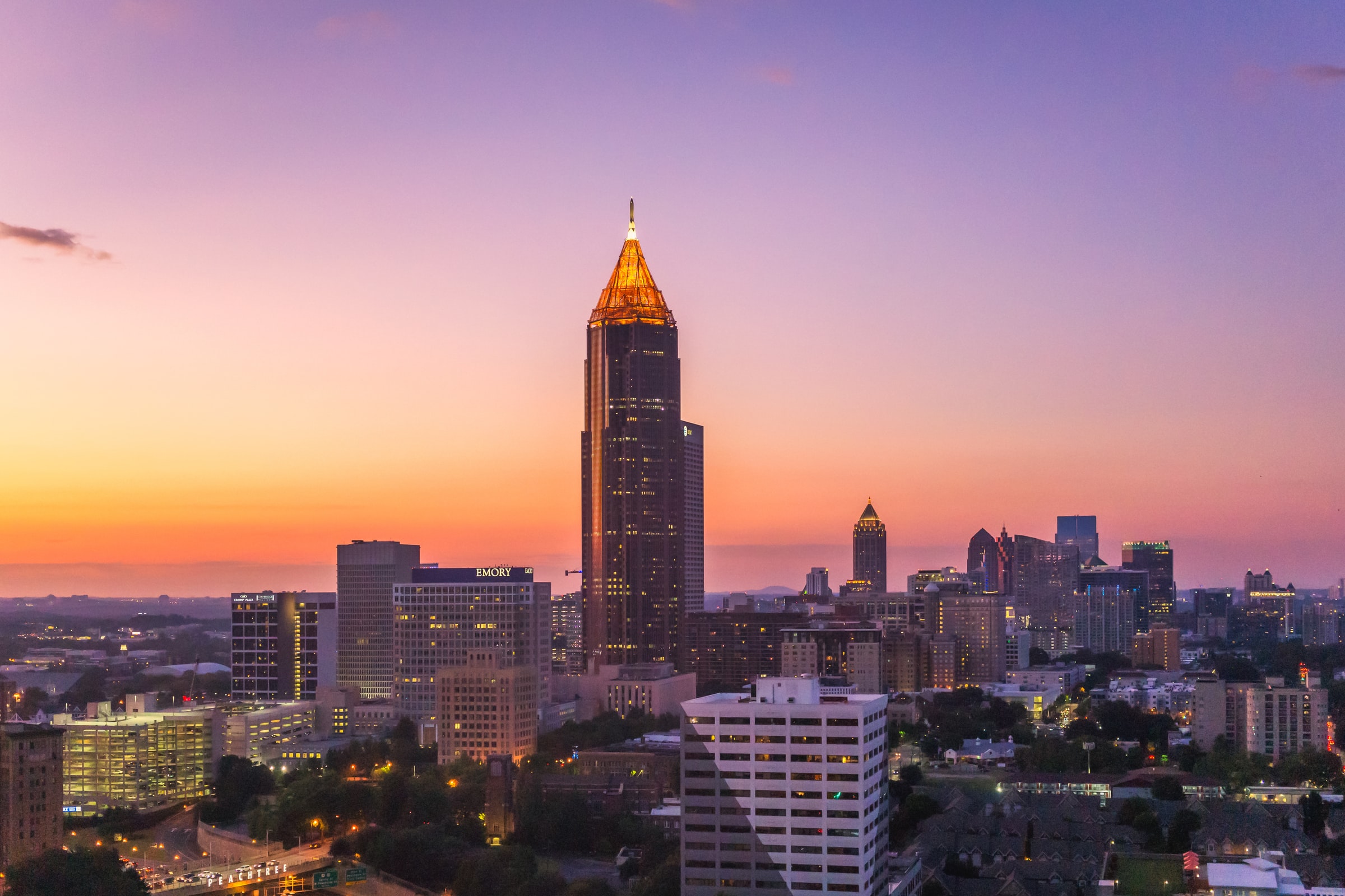
We’re proud to call Atlanta home, and it’s a home we share with several other companies we think you’ve heard of. Oh, you know, like the occasional multinational corporation or two.
We decided to look into how the logos came together for a few of those companies below. Enjoy!

Coca-Cola Keeps it Consistent Over a Century
Perhaps no other brand is more closely associated with Atlanta than Coca-Cola. Their headquarters are just one mile from our office! And the company’s original logo design remains in place today (with some minor tweaks) over 130 years after its creation.
Pharmacist John Stith Pemberton invented the Coca-Cola drink in 1886, advertising it as being helpful to relieve headaches and other ailments. Pemberton’s bookkeeper Frank Robinson named the product and created the world-famous script logo in 1887.
The name was coined so customers would know that the coca leaf and the kola nut were vital ingredients in the drink. And Robinson thought the two curly Cs would look good in advertisements. We agree with him!

Robinson came up with the flowing logotype in Spencerian script, which was developed in the mid-19th century and was the preeminent form of formal handwriting in the U.S. during that time, according to The Logo Creative.
The logo was trademarked in 1893, leading Coca-Cola to add the word “trademark” to the tail of the first C that year. The word was later moved below the logo in the 1940s.
In 1969, the company introduced a white wave flowing underneath the script and added the word “Enjoy” above the logo. This is often still used today. The company reformulated its signature drink in 1985, leading to a huge backlash and the reintroduction of the original formula “Coca-Cola Classic,” with the word “classic” added to the logo.
In 2003 the white wave was enhanced with a shock of yellow and some bubbles. Then it was back to the classic design in 2007, with the Coca-Cola script, the word “classic” underneath, and the white wave underneath that.
But through all those tweaks, the look and spirit of the 1893 design are still intact, which is quite remarkable! The company has also firmly embedded itself in the city of Atlanta over the years, and we’re proud to have them here.

The Home Depot Builds a Basic Logo to Last
Another well-known corporation headquartered in Atlanta is The Home Depot. Bernie Marcus and Arthur Blank founded the home improvement store in 1978 and quickly expanded nationwide and eventually worldwide.
The company now has over 400,000 employees in 2,300 locations and generates over $100 billion annually.
But how did that famous orange logo come together in the beginning and stand the test of time over 40 years later?
Marcus and Blank consulted branding visionary Don Watt to help come up with the logo. Many looks were considered (as detailed in this corporate history), but the stenciled logo won out in the end.
The logo was inspired by crates used to transport freight (lining up with the “depot” theme) and stamped at an upright angle to symbolize success. And that classic orange? It was chosen to stimulate activity and is reportedly associated with affordability.
Some consider the logo too generic, but going the minimalist route gives it a DIY feel. And what’s more DIY than a home improvement store?
And a fun fact: the font is actually called Stencil. The company didn’t commission a customized font like most others of its size do, instead opting for a font you can find bundled in Microsoft Office.

Delta Air Lines Works its Way to a Widget
While Coca-Cola and The Home Depot’s logos didn’t undergo much of any changes over the years, that’s not the story for Delta Air Lines.
The company was founded nearly 100 years ago in Macon, Georgia, as a crop-dusting operation. It added passenger service in 1929, then moved its headquarters to Atlanta in 1941. Delta now has over 90,000 employees and over 800 planes that travel to 325 destinations worldwide.
Delta went mythical with their original logo. It featured Mercury, the Roman god of travel and commerce, at the center of a triangle, which represented the “D” of the Greek alphabet (or, naturally, delta).
In 1934, they scrapped that for a red-winged triangle in front of a blue, white circle and the company’s name. A brief merger with Chicago & Southern Air Lines in the early 1950s led to another logo change. When that merger ended, the company went with a Flying D logo, which was sometimes used in prior years.

The famous Delta “widget” logo was introduced in 1959. It was turned sideways to represent the speed of jets from 1959 to 1965, then returned to face upwards later in the 1960s and 1970s.
Several variations followed in the years to come; then, the company removed the words “Air Lines” from its name at the beginning of the millennium. The widget on the left remained, along with the classic Delta red, white and blue color scheme.
The logo was redesigned again in 2007 with a 3-dimensional red widget logo. It was introduced on the day Delta exited Chapter 11 bankruptcy protection and was meant to reflect the company’s transformation into a customer-focused, highly differentiated airline.
Global brand strategy and design company Lippincott developed Delta’s new look, which remains to this day.
We love the story that the latest logo tells, where even the largest companies go through tough times and figure out how to come out on the other side. We need to hear stories like that now more than ever.
There’s plenty of other famous companies headquartered in Atlanta that we wanted to feature, but we’ll have to save those logo stories for future blog posts. So keep an eye out!


