


DESIGN CHATTER
RECENT POSTS

How This Design Campaign is Changing Women’s Soccer
Nov 01, 2018
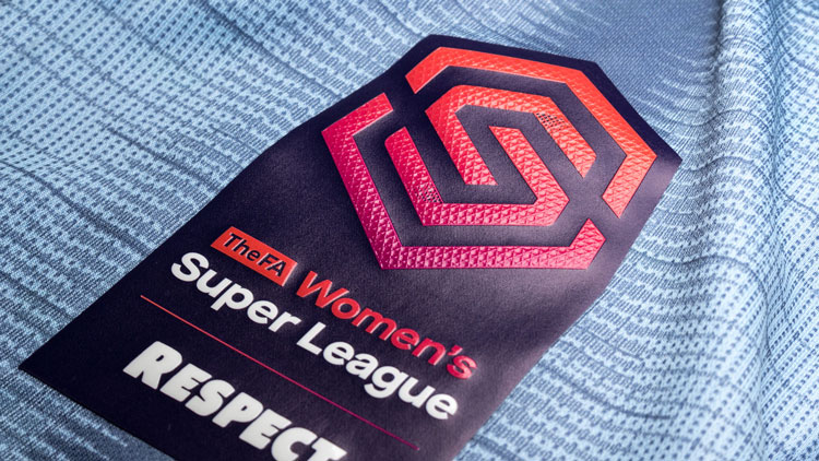
We love when graphic design inspires real-world results, and design studio Nomad is doing just that with a recent campaign. The Football Association hired Nomad to help rebrand its women’s soccer leagues to get more people (and in particular, girls) to watch and participate in “the beautiful game.” A goal was to double attendance figures to its Women’s Super League games by 2020.
“We wanted to create something that didn’t look like a traditional football or sports brand, so we deliberately steered away from silhouettes of women, footballs and things like that,” Terry Stephens, partner and creative director at Nomad, told Design Week. “It’s about creating something that girls would aspire to have on a t-shirt or school bag.”
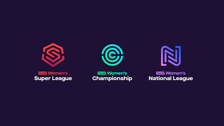
Their goal was toe create a “halo brand” that would cover all three leagues but also give each one an individual character. To achieve that, they designed each logo with a single letter made of multiple lines and using a gradient of color tones.
Notice how the “S” for the Super League is reminiscent of a certain superhero symbol?
The shape of the “C” for the Championship league’s logo imitates a springboard, since the league is considered a gateway into pro soccer.
The “N” for the Nation league’s logo is supposed to represent camaraderie, community spirt and unity.
And that’s just the start of the dynamic thinking that went into this forward-thinking campaign. Yes, we’re geeking out a little bit over here! Read on for more.
Images courtesy of Nomad