Consistent brands earn more.   Find out why.
Discover how consistent
brands earn more.

Help Your Packaging Stand Out in Any Retail Market

Experience Your Design

Experience Keylay

4 WAYS TO HELP YOUR PACKAGING STAND OUT IN ANY RETAIL MARKET

When form meets function, it can be a beautiful marriage of impactful, creative design. Some of the best packaging design doesn’t scream with bright colors or bells and whistles. Although for some brands, this might be the exact thing that they need to make sure that their product stands out from the rest. Some companies may want to take a more sophisticated stance towards their packaging designs. For instance, many wine companies and various chocolate brands often have more sophisticated packaging. On the flip side, many clothing and accessory brands are more vibrant and radiate coolness. If you are looking for inspiration for your own packaging we’re going to break down what it takes to make packaging design o’ so good.

FORM AND FUNCTION IN HARMONY

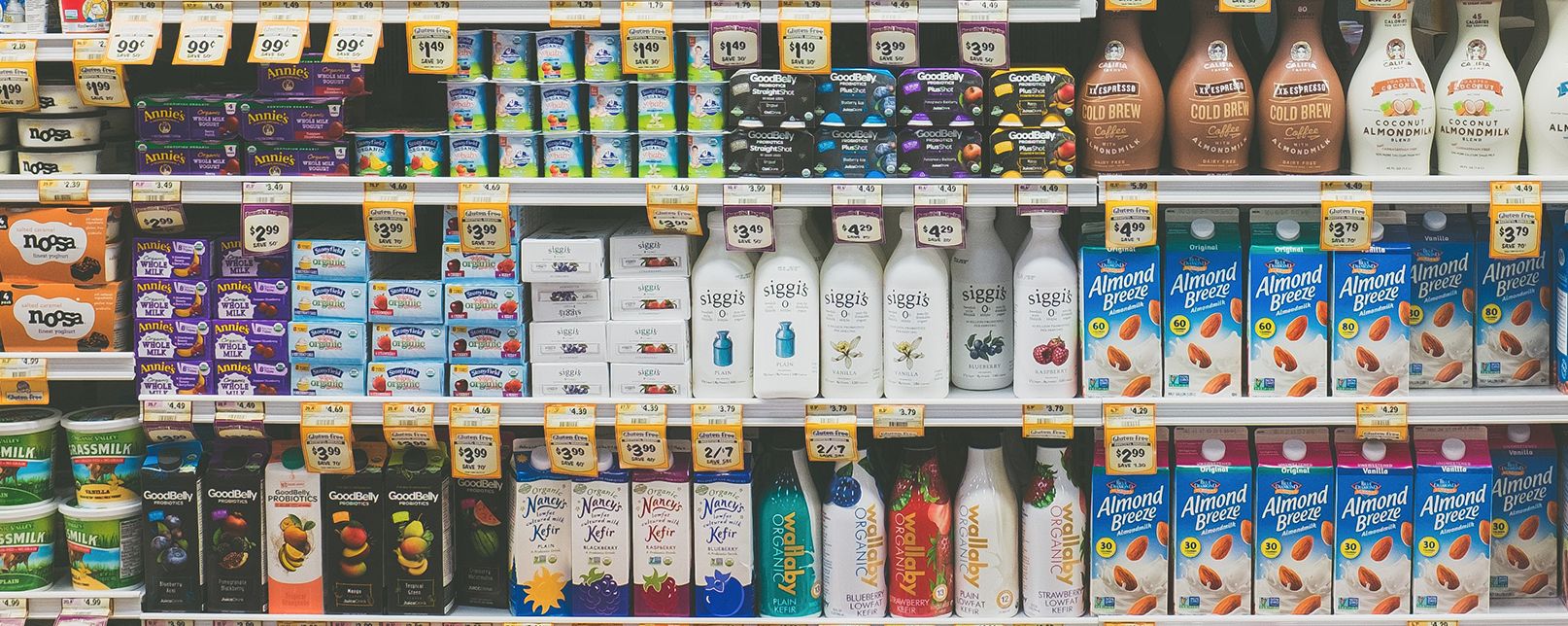
When placed on the shelf amongst a sea of other labels, new or unfamiliar brands can have a difficult time standing out. This is where it becomes important to have packaging that helps consumers make a quick decision about whether or not your product is beneficial to them.

In the study titled, Impact of Color in Marketing the results show that within 90 seconds of coming into contact with a product, between 60-90% of people base their opinion on the product solely based on color. This means that color has a subconscious, emotional trigger for most consumers. As a result, your product could trigger a (hopefully) positive response completely based on which colors a graphic designer uses.

Here’s a handy little chart that gives some insight into the types of emotions that certain colors can trigger:

DESIGN SIMPLICITY

It’s easy to think that all designs need to have flashing lights and flare to gain attention. Sometimes the best solution is to tone it down a little and show the elegance of the product. Not bash consumers over the head with what it can do. If your packaging has a clear, name, logo, short list of benefits then it stands a greater chance of capturing the attention of those who are searching for your type of product. However, if there is too much information about your product on the box, then you run the risk of confusing or frustrating customers.

PACKAGING CONSISTENCY

While everyone might not agree with what makes something beautiful–it’s very subjective–we can all appreciate that too many changes in a product’s packaging are confusing. For instance, if you have a line of sauces being released every three months it would help the consumer–and your printing costs–to keep the overall design relatively similar. This means that you can have the same look and feel, but change other elements such as the color or illustrations.

UNIQUE PROBLEM SOLVING

Brands often have to come up with interesting ways to step up their game while holding the attention of their most rabid fans. Many companies use multiple forms of media to do this and others take a more creative approach.

STARBUCKS HOLIDAY COLORING CUP

Starbucks has given their customers free reign to create their own custom color combinations with their holiday coloring cup. Even better, they want consumers to channel their inner kid by combining the classic coloring book with a warm holiday drink. Crayons and colored pencils sold separately.

FIELDWORK BREWING COMPANY

In the case of Fieldwork Brewing, they take beer connoisseurs on a wonderful trip around the world in the comfort of their own home (or pub). They’ve taken a simple can and formed it into a descriptive scene that includes tasting notes corresponding to each location.

METHOD SOAP

For the environmentally-conscious, Method has released new packaging that combines form and function while helping Mother Earth. Using ocean plastic, (sadly, there is plenty of it out there) they are helping do their part to not only clean hands, but the water as well.

Grow Packaging

One of the more recent trends showing up in packaging uses mushroom fiber. Say wha?

Yes, the guys over at Evocative Design have made it their mission to produce big environmentally-friendly materials that leave a small footprint. Need to create cost-effective packaging for your latest wine design? They’ve got you covered. You can easily create your own packaging using their “Grow It Yourself” material using whatever form you choose.

While this is only the tip of the iceberg, the number of innovative and cleverly designed packaging ideas continues to grow. These all go above and beyond to meet the requirements of good packaging design.

CONCLUSION

One of the keys things of great design is how accurately it reflects the brand and connects with the target audience. Can you look at the product and immediately know that it belongs to x,y,z? Do they feel an emotional response to the product? The most interesting and well-designed packaging combines form, function, and simplicity to grab people’s attention. Some of the most memorable designs often make use of ordinary substrates to take them to new levels of interest. So while companies are constantly vying for our attention, the ones who are successful take into account exactly how consumers will interact with their products on the shelf. Well-designed packaging is dynamic, sophisticated, and often creates an emotional connection, however brief with those who have the most discerning eye–the consumer.

▼ E-MAIL US NOW

Name(Required)