


Website typography: Best practices for using fonts on your company’s site
Feb 10, 2023
The elements you choose for your brand tell a story, especially your fonts. And this typographical tale becomes incredibly important online, where you only have moments to grab someone’s attention.
When you have issues with readability, accessibility, or legibility, whatever story you tell — even if it’s a good one — will leave site visitors frustrated if they can’t read it.
We’ll go through the best practices for using website typography, so you can have the tools to know that you’re giving customers the best experience online.
A brief history of typography
As Robert Bringhurst points out in The Elements of Typographic Style, “Typography is to literature as musical performance is to composition.”
Modern typography is a form of visual communication that evolved from older forms of illustrative writing like prehistoric petroglyphs and Egyptian hieroglyphs. Using typography organizes fonts in a way that makes them visually appealing using line and letter spacing, and sizing, among other features, to facilitate conversations and share messages with your audience.
In the digital age, typography unleashed new opportunities to democratize and standardize fonts across the web. It’s given businesses new outlets to creatively express their brands and values using typography.
Best practices for digital typography
Designing online is different from print. There are screen size and resolution constraints, accessibility requirements, and a host of other considerations for your customers reading online.
This means keeping a few rules in mind for your company’s website, emails, and other digital assets to ensure that your typographic treatments look good no matter where they appear online.
Use a readable font size – You don’t want to make people struggle to read your site’s navigation or body text. The smallest font size on your site for these elements should be 16px. However, 18px is more comfortable for reading larger blocks of text. If there’s a reason to go less than 16px, leave enough space around this text, so it’s still readable.
Let your letter-spacing breathe – The space between letters, known as tracking, can confuse readers online when it’s too loose or tight. If characters are squeezed together, people could mistake one letter for another, causing them to misread the word entirely. The same result is also possible when too much space between the letters forces the eye to not see certain characters while reading.
Break up text with unique glyphs – Each of the characters in your company’s brand fonts should be distinctive enough so people can easily distinguish between them. Choose contrasting typefaces to create a visual separation and hierarchy throughout the page.
Use your fonts wisely – When you have a few different typefaces that your team works with, it takes very little for those fonts to be misused. Website typography guides are beneficial to direct teams about how and when to use each font. They also prevent your header fonts from being used in your body copy and vice versa.
Guide people with a hierarchy – People have a short attention span online. And since 2000, it’s only grown shorter. Establishing a hierarchy gives people visual cues directing them toward what they should focus on. But if these cues don’t exist on the page, people won’t have the patience to try and figure out what it is you’re trying to communicate.
Take advantage of other visual cues – Bolding or italicizing words signals to readers that “Hey, this is important, and I should pay attention to it.” These font treatments make the eye pause on it because you’re making it stand out in contrast to the surrounding text.
Website typography examples in action
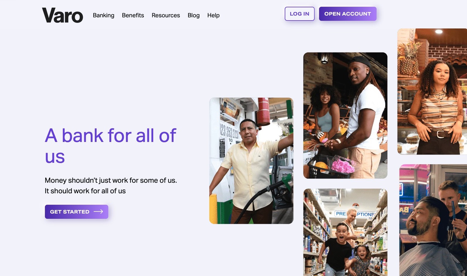
Varo
Online banking platform Varo uses light, airy sans serif fonts to highlight their services and customers.

As you scroll down the page, they combine iconography with a gradient over the text, causing readability issues. You want to avoid including any graphic treatments that compete with or impact the readability of your text online.

Gusto
Payroll solutions software provider, Gusto uses a combination of serif and sans serif fonts to create a pleasant experience for visitors landing on their site.
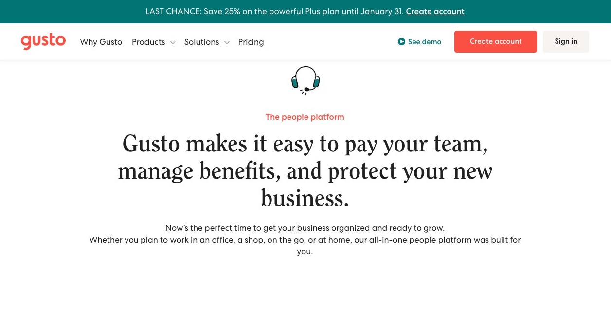
Even when their font size goes below 16px for “The people platform,” they use color to differentiate it from the header and leave enough plenty of space around it. They’ve done a good job of creating a comfortable reading experience for site visitors and leading the eye through the page without any distractions.
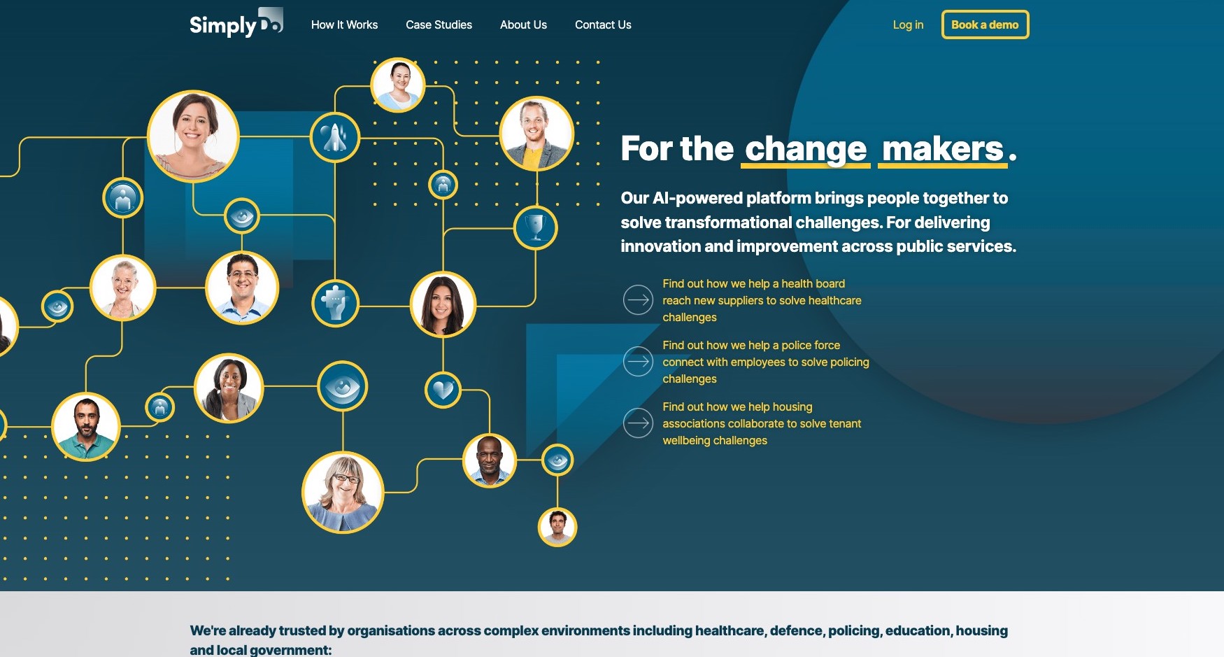
SimplyDo
For organizational tech company SimplyDo, they’ve created a visual hierarchy in their hero image. However, this area contains many competing elements. The title “For the change makers.” uses yellow to highlight the main point in the header. However, the yellow text beneath is hard to read and doesn’t gracefully lead the reader through it.
This site’s typographic treatments would work better if there were consistent elements on the pages and more white space include for the text to feel less cluttered.
What are your fonts saying about your business?
Fonts tell a story about your business. When customers land on your website, the typography used on the page will—if interesting enough—pull them further into it. Typography and hierarchy are so essential. Each works together to guide customers through your website, emails, and other digital media.
Your brand’s fonts are one of the essential elements people associate with your business. Maybe it‘s the fun vibes of a curvier typeface that doesn’t follow the rules. Or the strong serif font in the headers that exudes confidence and authority.
When you give them the attention they deserve, your fonts bring people further into the story you want to tell them.
