Why It Makes Sense to Choose Fonts That Grow With Your Business
Oct 07, 2022
We’re long past the days of using only a handful of fonts to create logo designs, advertisements, and business correspondence. Now there is a wide range of typefaces available for businesses to use to reflect the personality of their brands.
But when first working out the details of your brand’s design, it’s tempting to choose fonts based on personal taste. But beyond their aesthetics, there is much more to picking fonts for your brand that grow with you.
Fonts matter in branding
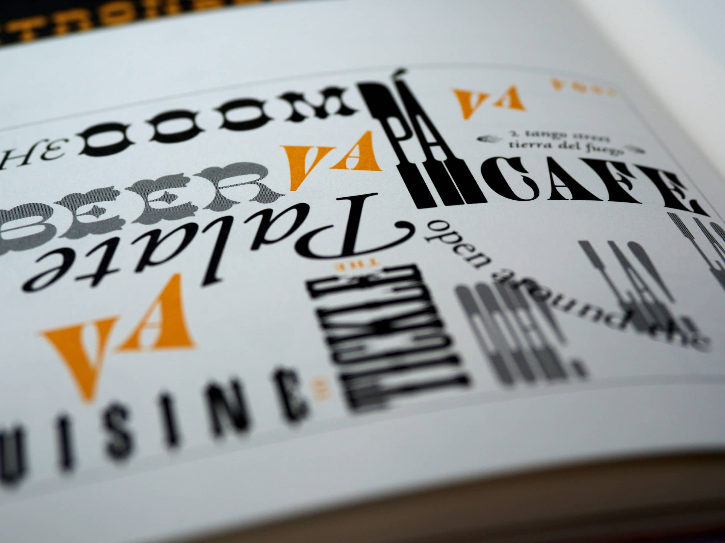
Fonts tell a story. In branding and marketing, your font’s character adds to your own. Cyrus Highsmith, a typeface designer and author of the book Inside Paragraphs, points out:
“Typography is the detail and the presentation of a story. It represents the voice of an atmosphere, or historical setting of some kind. It can do a lot of things.”
And for brands like M&M’S®, making changes to the original Monotype typeface and making it more inclusive and modern shows its evolving with the times and engaging a new generation of candy lovers.
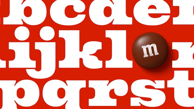
Steffi Marty, Mars’ Global Director of Brand Identity and Design, states their mission for this stage for the M&M’S brand.
“As the M&M’S brand takes on a wonderful purpose, we want the identity to reflect and support the communication of all of that. The intent of the identity is to live the purpose, to be more digitally savvy, and to make the purpose omnipresent in all we do,”
For M&M’s, their font is distinctive and flexible enough that with even an update, people can still look at it and say, “Hey! I know this brand.”
How do fonts affect advertising?
Since the early 20th century, designers and artists have experimented with how words and logos could work together. Advertisements were reinvigorated with grand, illustrative images and elegant font treatments.
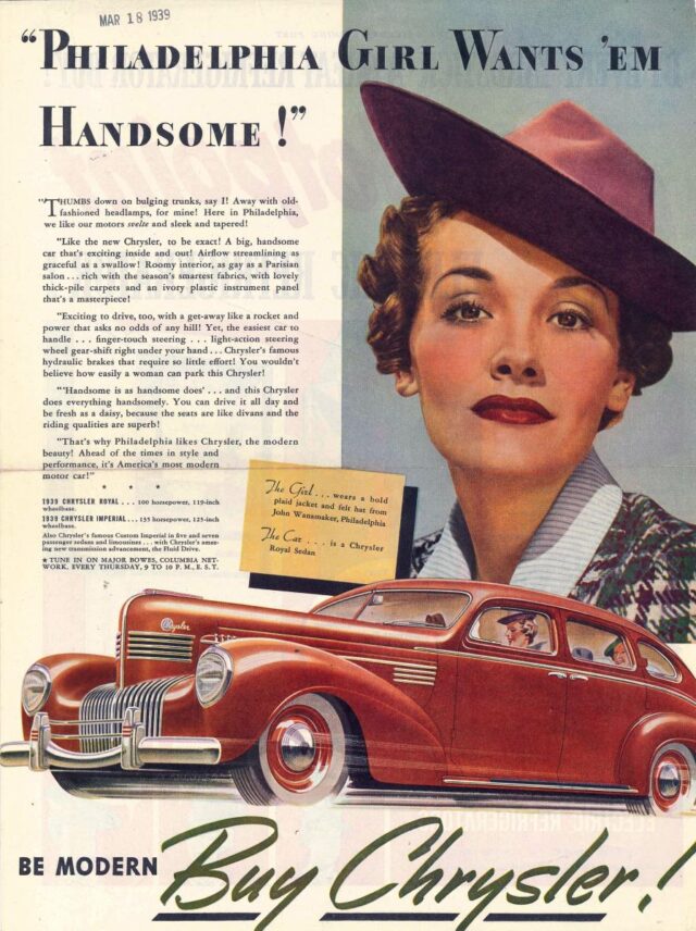
But many of these advertisements were inconsistent in their font usage. Car manufacturer Chrysler used typographic treatments to entice buyers to imagine themselves in their vehicles. Their lack of uniformity in font treatments created an imbalance in the brand’s image. Chrysler has since overhauled its brand to become one of the most identifiable car manufacturers today.
Classics like Times New Roman, Arial, and Cambria are recognizable and considered stable or safe. They can be used easily across various media and have been among the most recognizable preinstalled computer fonts for a long time.
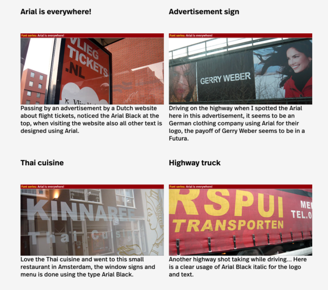
And businesses continue to use it now, as the Wayfinding Design agency /designworkplan pointed out in their article “Arial is Everywhere.”
Font treatments in advertising affect how information appears and influences how we feel about brands. Some fonts give off the self-assured, sophisticated vibes of the bulky, slab typeface found in Volvo’s logo.

But the main fonts, Volvo Novum and Volvo Broad Pro, serve as modern, classy additions to the brand guidelines.
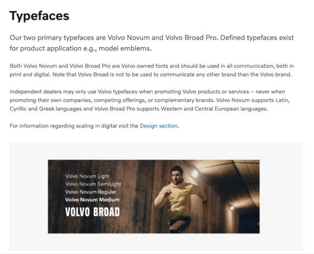
In Volvo’s case, these typefaces add to the brand’s legacy while retaining the most crucial characteristic of long-lasting fonts—readability.
Experiment: “If It’s Hard to Read, It’s Hard to Do…” Study
Researchers Hyunjin Song and Norbert Schwarz posed an interesting question about how fonts influence persuasion. Does the way we perceive information affect our activity? Song and Schwarz tested whether simple or complex fonts impacted how long people could commit to an exercise regimen.
They compared two groups. One set of participants saw instructions for the exercise routine using a minimalist font, Arial. The other set got the same instructions in a more ornate font, Brush. The latter font being harder to read.
The researchers hypothesized that people in the Arial group would feel like the exercise took less time to complete. This assumption stemmed from the fact that Arial is a sans serif, easily readable typeface. The group reading Brush would feel the opposite. And as a result, their exercise would last longer.
And the outcome?
Song and Schwarz’s findings revealed that subjects who read instructions using the Brush font took almost twice as long (15.1 minutes) to complete their exercise. Meanwhile, those with the directions in Arial took 8.2 minutes to finish. They were also more likely to stick with the training because it was easier to understand.
The takeaway is not to make your audience think too hard about what you’re communicating. When choosing brand fonts, consider readability. Larger blocks of text need to use typefaces that are easy to read and comprehend, even at a distance.
And while you can choose more adventurous fonts, they should be used sparingly as headers or subheads. Or when you want to call out a specific word for impact.
Choosing a long-lasting font
As your business grows, the right pieces must be in place. Your brand’s elements should be chosen for longevity, not popularity, right down to your font selection. Selecting a typeface may seem like an arbitrary decision, but it, like your company, has a personality.
And when combined with your brand’s other parts, they are what audiences respond to. So whether you’re using clean, subdued fonts like Avenir, a wildly expressive Yellow Script, or ultra-chic Richy, you’re sending a message. But whatever you do, don’t use Comic Sans. That’s a story for another day.


