4 Golden Rules for Creating Social Media Graphics
Feb 13, 2021
Any business with a social presence is fighting to stop people in mid-scroll so they can pay attention to their message.
As visual creatures, we’re hard-wired to respond to imagery in nature that piques our curiosity and catches our attention.
And it works the same way with social media. We respond to posts with interesting content.
So how can you improve your chances of interrupting the scroll cycle?
These are some of the best practices any business can use to create social media graphics that get people to take notice.
#1 Pay Attention to the Size Requirements Social Media Graphics
Each social platform has its own specifications for images and video—and they change often. If you’re creating graphics based on a template, this is especially frustrating since this can affect how well they appear.
No one wants to see a blurry product photo or squashed logo.
Many websites declare their social media image specs are the latest and greatest, but unfortunately, most are outdated.
We recommend going directly to the source and checking out each platform’s requirements.

If this feels tedious, Social Sprout offers an up-to-date resource listing the most popular social media post dimensions.
Image Compression
Each social platform uses image compression tools, which affects how well an image appears when uploaded. One image may look great when uploaded to Facebook but looks awful when shown on LinkedIn.
Our recommendation is to upload images at the maximum size recommended per platform and keep your resolution between 72 and 150dpi.
Images with a higher dpi will make your overall file size larger. You’ll want to keep that in mind when creating or resizing images.
#2 Stay on Brand, Except when it Makes Sense to Stray
This rule is one of the most important for any business to follow: stay on brand. Your brand is more than a set of colors or a logo. It’s your company’s values, voice, and messaging.
All of them work together to build the brand, and consistency helps it achieve longevity.
But there are times when a specific campaign you’re running on social media may call for a bit of deviation.
There are a few ways you can do this while still keeping in line with your brand standards.
Coke: Share a Coke
In 2014, Coke shocked the world when they gave thirsty fans the ability to share their favorite soda with friends and loved ones. In this campaign, the iconic Coca-Cola logo was replaced with one of 250 of the country’s most popular names.

People were encouraged to find a Coke with the name of someone who meant something to them. They could share the moment on social media using the hashtag #ShareaCoke.
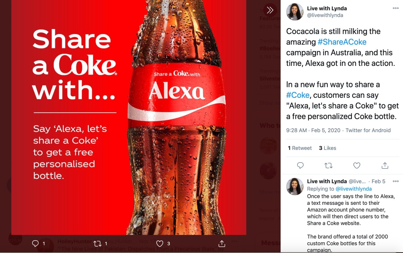
Six years later, the campaign is still going strong in collaboration with companies like Amazon. People can now get a personalized bottle of the famous drink by merely saying, “Alexa, let’s share a Coke.”
Coke maintained consistency throughout their social graphics during this campaign as one of the world’s most recognizable brands, even though the famous logo was missing.
It’s an example of what happens when a legacy brand bends the rules and takes a calculated risk to delight their fans.
Skittles: Give the Rainbow: Tastes the Rainbow Campaign
Skittles wanted to celebrate Pride 2016 and show solidarity with the LGBTQ community in a unique way.
Known for their explosively vibrant colors, Skittles took them away for the Give the Rainbow: Taste the Rainbow campaign. Not only was the candy and packaging devoid of color, but they also used social media to spread the word on YouTube and other platforms.
They wanted to show that only one rainbow matters, and we are all part of the same tribe. This campaign was so successful that they brought it back the following year.
#3 Keep Your Social Graphics Simple, Yet Interesting
Busy, complicated graphics may get someone’s attention for a moment, but not for the right reasons. If you’ve wondered how to make your social media graphics look better, remember that “less is more.”
Skimmable text with compelling copy and powerful words is one way to interrupt people’s scrolling. Another is to get creative with illustrations, photography, and color.
You don’t always need to use conventional methods to get attention.
Illustrator Brian Cook showcases his drawings and products using simple photography with a focus on butts on things.
Yes, you read that right.
From coffee cups to Yoda, Cook features each one of his creations in an extremely memorable way. As a result, he’s gained a large following on Facebook and Instagram, which are the perfect places to display his work.
You don’t have to go as far as Cook, but it’s worth exploring unique ways to present your products or services.
#4 Make Sure Your Images Represent Your Demographic
Future (and current) customers want to see themselves in your products and services. If you’re going to use images featuring lifestyle photography, they need to reflect your customers.
For instance, if your audience skews older, it makes sense to use photography featuring this age group participating in activities they would normally engage in.
The goal is to set realistic expectations in their minds that you understand and see them. You don’t want to turn anyone off because you’re showing images people can’t identify with.
Use Your Images to Connect
You’re competing with many different brands on social media, and each one is vying for the users’ attention. As a business, every post is an opportunity to connect with your audience.
Make it easy for them to stop and take notice of what you have to offer with attention-grabbing graphics.


